Preston Is My Paris: Reflections On Social Class In Art And Photography
With very little writing accompanying the photographic essays of Preston is my Paris (PPP), we are left with only the semiotics of images and imagined narratives. Here, Ruth White interprets the publications’ underlying political and social significance…
The statement “Preston is my Paris” conjures up all sorts of ideas and unfortunately, because of recent terrorist attacks, Paris now also represents something very frightening and topical. Regardless of films such as Mathieu Kassovitz’s La Haine (1995) and Laurent Cantet’s The Class (2008), which reveal the dark underbelly and socio-economic problems of Parisian society, Paris is a city traditionally associated with romance, modernism and the photography of Eugène Atget and Henri Cartier-Bresson.
In contrast, Preston only gained city status in 2002 and, like many post-industrial Northern towns, since the 1970s has suffered from deindustrialisation, economic deprivation and high rates of unemployment. Despite its regeneration in recent years, it is a place that for many people does not represent anything in particular and for some embodies bleakness and poverty – certainly not high culture or anything picturesque.
“Preston is my Paris”, if thought about as a narrative, leads one to imagine the life of a resident of the city, who out of necessity has learnt to make do within his narrow horizons: “I may be poor and my options may be limited” he thinks, “but I’m happy with my lot — who needs Paris when I have Preston!”
But Preston is my Paris (PPP) is the title given by the photographers Adam Murray and Robert Parkinson to their first zine, an A5 black and white photocopied booklet containing images and photographs from a range of sources — all of which related in some way to Preston. Since its conception in 2009, PPP has become the name under which the pair have continued to build up their photographic archive of places in the North. “Initially it was about just giving a reason to explore Preston”, says Murray. “The more we learned about cities and places the more we looked into it”.
To my surprise and disappointment, I discovered that the name PPP was appropriated from the tagline of a commercial for Clark’s shoes which was seen on the television at the time of PPP’s inception. It is tinted to give an old film effect and is accompanied by nostalgic Parisian music, as an elegantly dressed lady puts on her Clarks boots then leaves what appears to be a Parisian apartment; she rides a bicycle with a basket mounted on its handlebars, buys a cake from a patisserie, and then rather smugly eats it on the steps on what is possibly Preston’s Harris Museum and Art Gallery.
She goes on to prance through a park, buy something from a market stall then giddily walks and spins through a public square filled with pigeons as she gazes at the sky. Finally, she is stopped in her tracks and brought crashing down to earth from this idyllic reverie by the voice of a pensioner with a Northern accent and the stares of on-looking shoppers. At this point, we hear that the woman herself has a strong Northern accent. Accent, which in Britain has always been an unwritten signifier of class position and has been used in a similar way in Heineken’s Water in Majorca (1985) and Boddingtons’ Cream of Manchester (1992) adverts, suggests that the woman is in fact more than likely from a working class background.
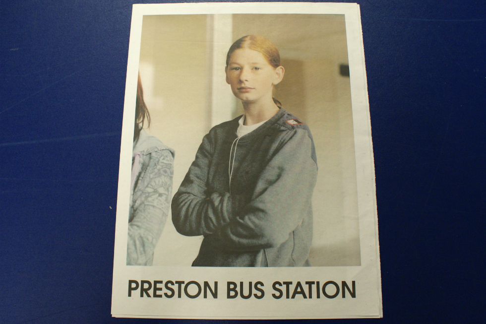
I interviewed Adam Murray at Manchester Metropolitan’s (MMU) Special Collections department where they hold a number of PPP publications. We discussed one of PPP’s early works, Preston Bus Station (2010). “I guess one of the big things with Preston is the bus station”, comments Murray. “It tended to be that attention was focused more on the building than the people who used it. We just wanted to produce something that focused more on the people that could be given away for free around the bus station. So that’s why we did a newspaper; me and Robert and Jamie Hawksworth. We got an old, disused National Express ticket office and used that for I think, two weeks, like a base, like an office or a studio type-thing. And just spent time in there, getting to know the place. And we spent three days over a weekend constantly in there, just photographing it all”.
Preston Bus Station was produced as a colour newspaper that was handed out free at the station itself and was also sold at a cost of £3 to interested parties. A central tenet of PPP is that their publications should be accessible to a wide audience and sold as cheaply as possible or given away.
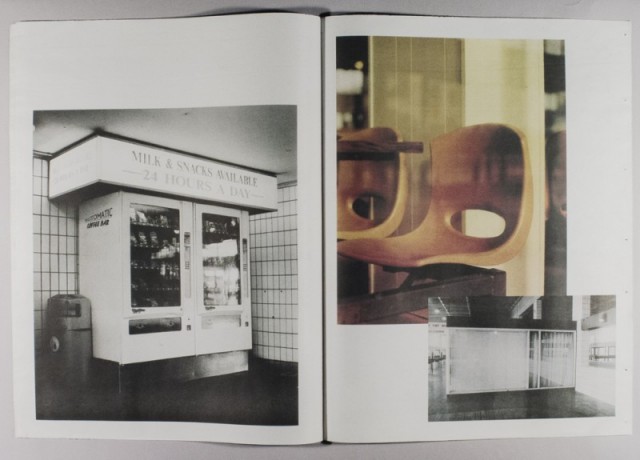
The cover of the newspaper features a mysteriously beautiful yet at the same time quite ordinary looking, androgynous teenage girl with red hair tied back, pale skin and freckles, of an age it is difficult to judge. She could be 12 or 15. She wears a white t-shirt and smart blue sweatshirt and no makeup. Just out of shot stands her friend, whose sleeve can be glimpsed on the edge of the photograph. The newspaper also contains an image of a boy who is of indeterminate age wearing a track suit; another boy wearing a hooded track suit top who is sitting, slightly huddled, his face obscured by shadow; a man who appears to be a bus driver smoking on his break; another bus driver about to drive off in his bus; and a number of images of objects in the bus station, such as chairs and a vending machine.
The fragile quality of the paper used for printing news is not something we ordinarily think about – we recycle or throw newspapers away on a daily basis without a second thought; but in this context, the newspaper becomes more precious, not less.
As a second year PhD student investigating the representation of the British working classes in art since 1975, PPP’s publications interest me primarily because of what I see as their class content. The girl on the front cover of Preston Bus Station could have stepped out of a Pre-Raphaelite painting, and what I find so compelling about the photograph and about the rest of the fashion photographer Jamie Hawkesworth’s photographs of people in the bus station is their humanity and sensitivity — qualities that are perhaps not traditionally associated with the cut-throat world of fashion.
Hawkesworth makes people who would probably consider themselves to be quite ordinary, appear extraordinary — but in a way that they do not appear as an exotic ‘other’. Murray suggested that Hawkesworth approached the project without any pre-conceptions, therefore it could be assumed that he did not take the photographs for any other reason than to make beautiful and arresting images of people he found aesthetically pleasing in some way.
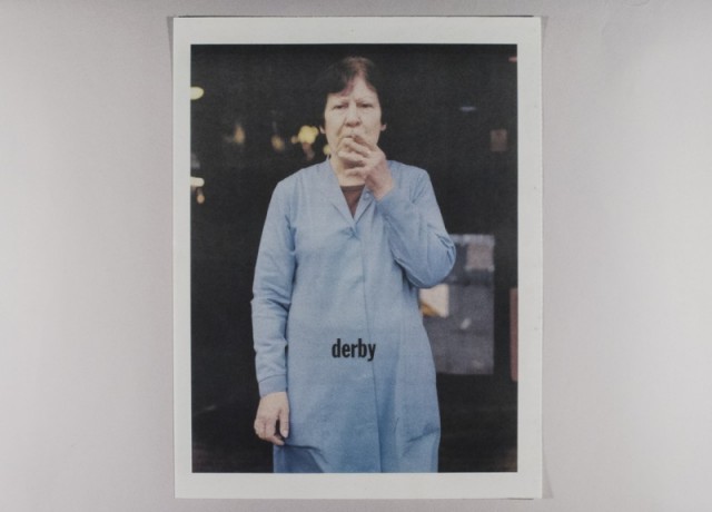
When I suggested to Murray that the girl is most probably from a working class background because of the way she is dressed, Murray replied: “I guess the thing is to consider the assumptions you are making about other people, and how do we know? A lot of them [PPP’s images] don’t have any people in for a start”. I pointed out to him that it was fair to assume that the woman who looks like cleaner on the front cover of one of their other colour newspapers, Derby (2011), is working class, and he replied: “That’s the issue, that’s what’s interesting about dress and everything, it’s like… from one image, what assumptions do we make about those people? I guess with most of this, it isn’t focusing on a particular group of people”.
I agreed that it is true to a certain extent that people from all classes wear sportswear, yet a bit like the optimist I mentioned previously — who is satisfied with living in her version of Preston — for many people from poorer backgrounds, the choice of what they wear is limited. Indeed, it can be argued that for many young people who live in poorer areas, sportswear is a uniform that allows them to be accepted amongst their peers. It certainly was the case for me in a 1990s comprehensive school in Walton, Liverpool, where I was bullied for not wearing an expensive brand of trainers.
Derby, which contains a mixture of colour and black and white photographs for which Murray and Parkinson also collaborated with Hawksworth, can be said to behave in a similar way to Preston Bus Station. The front cover features a woman in blue overalls in her 60s or 70s, with pale skin, unnatural looking black hair and thin, drawn-on eyebrows. She stands facing the camera and is taking a drag on her cigarette. The semiotics of the image suggests that she is possibly a cleaner or shopworker, or occupied in some minimum wage job.
In the hands of a photographer like Martin Parr, a similar image could well appear harsh and unforgiving, but because of Hawkesworth’s sensitivity and the fragility of the newspaper, the image is aesthetically pleasing and the woman comes across less as a ‘type’ to be critically examined and more as an individual. Derby also includes an image of a car wash worker who looks like he might be a European migrant; a youth wearing a red bandana around his face, his hood up and a sparkler in his mouth; a solemn pensioner wearing a smart hat and coat; and a brass band marching in a street, whose faces are obscured by their instruments.
Given the documentary and archival nature of PPP and the tropes of conceptual art Murray and Parkinson have employed in site specific works, I was surprised to discover that although Parkinson’s BA is in Fine Art and his MA in Photography, Murray’s BA and MA is in studio-based Fashion Photography: “My interest is still fashion photography” he told me. “It’s more about people, I guess, and what they choose to look like is what’s exciting. So, like these ones that Jamie takes, what’s made her look like that? And it’s not a good or a bad thing, it’s just how she is, and all the different meaning that can be generated through dress and appearance.”
When asked if there are any political inflected meanings in the work he admitted: “Yes ,well, not explicit: there’s always that underlying awareness of it all, I guess. But if we presented it as this, almost difficult, academic thing, people would be put off by it; it’s quite intimidating, isn’t it? When you see something that’s complicated language or, high-end production or expensive, or something that has a very strong point of view — it can be quite intimidating and put people off”.
Regardless of intent, I would argue that Preston Bus Station and Derby perform a political act. Political because of how they are read, their relatively positive representation of individuals from working class backgrounds, and the way in which they were distributed freely within the area. This is in contrast to what I perceive as a lack of positive representations of working class people in visual culture over the last 30 or so years. The art world and art publications may only make up a small part of visual culture, but it can be argued that they still play a significant role.
In the British mass media, the general public have had to become used to a diet of Jeremy Kyle and endless programmes about Benefits, featuring people who are quite often portrayed and perceived as being the ‘undeserving poor’. All of which has served to harden public opinion towards those dependent on welfare and legitimise successive attempts by governments to roll back the welfare state.
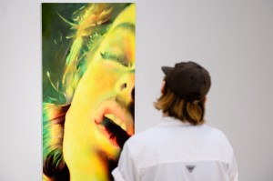
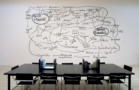
With the exception perhaps of Gogglebox (2013 onwards), long gone are the days of The Likely Lads (1964-76) and Bullseye (19981-1995). Instead, in recent years we have had the fecklessness of Little Britain’s Vicki Pollard (2003 -2007) and the characters of Shameless (2004-2013). In the art world since the 1990s — with the exception perhaps of Jeremy Deller in his video of the re-enactment of the confrontation between picketing miners and the police in 1984 in The Battle of Orgreave (2001) and his celebration of working class culture in Acid Brass (1997) and The History of the World (1997-2004) — the focus in some of the most well-known art works has tended to be on those at the very bottom of the heap in British society. Examples include Richard Billingham’s photobook which centres on his unemployed, alcoholic father in Rays a Laugh (1996); Gillian Wearing’s works about a group of street drinkers she got to know in Theresa and… (1998) Drunk (1997 – 1999), Prelude (2000); Keith Coventry’s works about crack addicts in Crack City Series (1998 -1999) and Matt Collishaw’s video that depicts a homeless person in a snow shaker in Snowstorm (1994).
Working class life since the 1970s has become much more insecure. Working class communities have become fragmented, employment is more precarious, the trade unions are a shadow of their former selves, and New Labour in the 1990s abandoned their social democratic ideals, embracing the free market and many of the policies of Thatcherism. Yet, despite the obvious class content of the works I have mentioned, and the significance of the restructuring of the British economy and reconfiguration of the working classes since the 1970s, very little appears to have been written about the British working classes in contemporary art in recent years, with the exception of writers such as John Roberts and Julian Stallabrass.
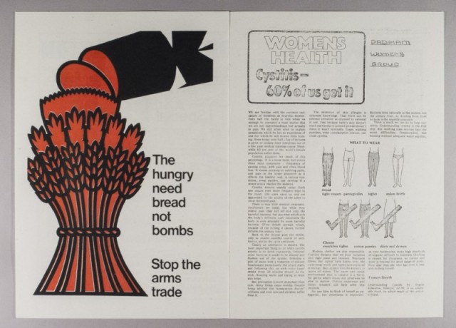
Edith’s Scrapbook (2013), a collection of reproductions of newspaper clippings and other ephemera relating to a number of British political protests in the 1970s and 1980s, with which Robert’s grandmother was involved, could be said to be PPP’s most overtly political work. The scrapbook is accompanied by a cassette tape, which features a mix of unknown protest songs with ambient sound from a student fees protest from the university where Murray works (recorded by Robert Griffin and Parkinson), plus a photograph and a poster. The scrapbook itself reveals Robert’s grandmother’s interests in feminism, women’s health, the Campaign for Nuclear Disarmament (CND) and Thatcherism, and was simply reproduced almost exactly how they found it.
I would argue that the inclusion of Edith’s Scrapbook in MMU’s Special Collections and amongst PPP’s archives has a cumulative effect on how the rest of PPP’s publications are interpreted. With very little writing accompanying PPP’s photographic essays or on their website, we are left with only the semiotics of images and imagined narratives. The overt political references in Edith’s Scrapbook suggest to a viewer trying to find meanings in the work that there is most probably some sort of underlying political significance; so perhaps I can be forgiven for reading more deeply into the work than the producers are prepared to admit.
Ruth White
This article has been commissioned by the Contemporary Visual Arts Network North West (CVAN NW), as part of a regional critical writing development programme funded by Arts Council England — see more here #writecritical
See more from Preston is my Paris (PPP) on their website
Images from top: Preston Bus Station (2010) front cover, photographed by Ruth White at Manchester Metropolitan’s (MMU) Special Collections department. Preston Bus Station (2010) inner pages; We don’t mind people on shoulders. Just not under the ceiling fan (2013) inner pages; Derby (2011) front cover; Edith’s Scrapbook (2013) inner pages — all courtesy Preston is my Paris (PPP). Jeremy Deller’s The History of the World (1997-2004), exhibition view, Turner Prize, Tate, London, 2005 © Tate Photography.