Tech Vs Tradition: Design Manchester & The Science of Imagination
Alex Croll is introduced to the designers, publishers and illustrators forging ahead with the latest technology to push their sector firmly into the future. But what does this mean for the traditional, physical and tactile element of making?
This year’s Design Manchester takes its title from an unlikely partnership with the Manchester Science Festival; the two are running side by side this year, highlighting parallels between design and science that have surfaced during the internet age. This collaboration could be seen as yet another representation of the friendly partnerships springing up in the North, allowing things to get done in the region without the need for significant external funding.
Design Manchester’s headline Core Festival Day last Friday, brought together a number of the design community’s leading voices for a series of talks; the day providing insights into different disciplines from the design profession. Now in its second year, a bigger and better venue was required, and the Great Hall in Alfred Waterhouse’s neo-gothic Town Hall provided just that. Although admittedly, it also distracted me from the events of the day; I couldn’t stop looking at the beautiful gilded ceiling, faintly glimmering high above the chandeliers.
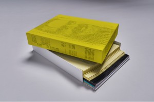
The first speakers of the day, Adrian Shaughnessy and Tony Brook from Unit Editions publishing, seem to teeter on the edge of a paradox, in which the technology so important to their craft is actually threatening its very existence. In order for the book company to move away from the restrictions and compromises of mainstream publishing, Unit Editions have taken control of the whole process themselves, from design to doorstep, with even the packaging tape getting their design treatment. From its inception, Shaughnessy and Brook knew they were competing with the immateriality of the internet age, an age where books have to justify themselves as physical objects. Making books for designers, by designers, Brooks sums it up perfectly: if you are going to chop down a tree to make a book, then at least make something beautiful.
When designers talk about their products, they have the difficult job of discussing its merits without straying into sales pitch territory. Daniel Hirschman of Technology Will Save Us was treading this fine line; he discussed his range of electronic kits aimed primarily at children, which look to teach them the skills of the 21st century. Hirschman’s talk didn’t come across like a sales pitch, yet I still felt I had to resist in some way, as I’m sure many of the audience did. The second half of his talk looked at Hirsch&Mann, a “thinking and making business”, which shares the same playful use of electronics, but this time put to work for corporate clients, such as Red Stripe’s Corner Store Music. The creations share the same ‘unfinished’ look, honest in revealing their componentry; an aesthetic of exposed wires and circuit boards. This impermanency invites further investigation, putting the technology to use in different ways, allowing the user to take control of the design process.
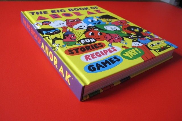
Rob Lowe, better known as Supermundane, had within moments presented the audience with an image of his head superimposed onto the body of actor, Rob Lowe, after pointing out writers’ tendencies to follow his name with: “not that Rob Lowe”. What followed was a technicolour showcase of Lowe’s work over various realms of graphic design; from his independent magazines, Anorak (above) and Fire & Knives, to his intricate artworks. With creativity rushing out of him — like the gods and demons depicted for his You Made Me series of prints (2012) — Lowe is the tireless designer, who finds it easier to design new typefaces to accompany his work than spend the time searching for one that he likes.
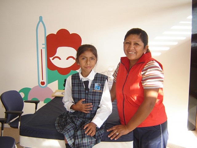
Rejane Dal Bello was a refreshing addition to the bill. The designer, formerly of Studio Dumbar and Wolff Olins, began with the story of how she got to where she is now, with the choices and mistakes she made along the way, charting her career back from when she was a student. Now running her own studio, she is able to take on work that isn’t necessarily solely about making money or paying wages, but work that she is genuinely interested in. This becomes apparent as she presents her pro-bono work for Paz Holandesa Hospital, a non-profit children’s hospital in Peru, in which she has provided a new visual identity (above). This all-encompassing design covers everything within the hospital, from signage and business cards to teacups and colouring books. Dal Bello’s latest project — a children’s book entitled Dr Giraffe — will turn to online creative funding platform, Kickstarter, to bring it into fruition.
Next up, Ross Phillips from Dalziel and Pow, who uses technology to create interactive environments on the high street, closing the divide between physical stores and the online world. One of the main drivers in this process is the development of projection mapping — the technique of projecting onto non-flat surfaces — which has seen a huge increase in its potential and popularity during the past decade. Perhaps the most successful use of this presented by Phillips was in their work for The White Company, in which we saw text projected onto a teapot, as well as moving figures projected onto various posters around the store. It wasn’t necessarily the technological prowess displayed that was the most impressive thing, but more the subtlety in the way it was conducted. Concealed projectors and the absence of screens generate an almost-seamless interaction between the physical world and the digital, something that will only improve in near future.
The final talk of the day was Michael C. Place of Build, in conversation with Design Week’s Angus Montgomery. Like the day’s compere, Malcolm Garrett (Royal Designers for Industry), Place began his career designing record sleeves. Place was living the dream, designing the artwork for the bands he loved. However, times have now changed: Place believes that vinyl, despite is ongoing resurgence, is a thing of the past and album artwork no longer holds the same significance that it once had. Surprisingly, Place’s studio rarely gets the opportunity to do this kind of work, and when it does, it is not as lucrative as the other work happening within the studio, and is therefore usually reserved for when they have a genuine interest in the band.
In keeping with Design Manchester’s theme of The Science of Imagination, all of the day’s contributors attempted to incorporate the interplay of science and design into their talks, although some attempts appeared a little more contrived than others. Daniel Hirschman and Ross Phillips are undoubtedly the most embracing of technology in their work, actively seeking out new methods, whilst the some of the others appeared a little more passive. Their use of technology wasn’t quite so much pushing boundaries, as remaining in sight of them. This is by no means a bad thing, as a reduced reliance on technology promotes creativity through other means: it is clear that new technology should be adopted when deemed suitable for a designer’s individual method of work.
Whilst science and technology have provided a significant number of new opportunities in design, we must not forget that it has also removed others. As we switch to a more electronic, digital way of thinking, we are gradually losing the material, tactile elements of design: design that is held and admired with a number of the senses, rather than just from behind a screen. One of the slides from Unit Editions’ presentation contained a quote by Umberto Eco from This Is Not the End of the Book:
“The book is like the spoon, the scissors, the hammer, the wheel. Once invented, it cannot be improved.”
So long as these physical objects continue to provide the qualities and stimulate the senses that the digital image cannot, they will still have their place.
Alex Croll
This article has been specially commissioned for The Double Negative by Liverpool John Moores University and Arts Council England. Part of the collaborative #BeACritic campaign — see more here
More from Design Manchester and Manchester Science Festival
Catch the adidas SPEZIAL exhibition, as part of Design Manchester 14, until today, Sunday 2 November 2014, 7 Dale Street, Manchester — open 12-8pm, free entry. Read our review here
![]()