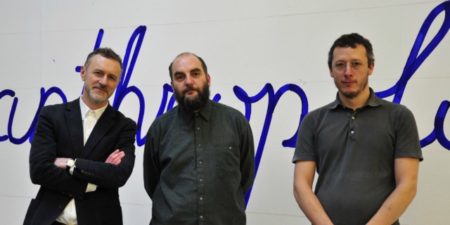
For the Love of Typography: Luca Frei and Will Holder In Conversation
As they unveil a new typography at Tate Liverpool, artist/designer team Luca Frei and Will Holder discuss drawing tools and school-age penmanship with Mike O’Shaughnessy…
Luca Frei and Will Holder may work quite differently, but both see parallels between typography (the organisation of language) and other social structures. The former is known for creating alternative spaces, using installation, performance, drawing and text; the latter, a well-known designer and writer whose work operates between ‘fixed and fluid forms of communication’. Both have been commissioned by Iniva and Tate Liverpool to illustrate the themes of new exhibition Keywords: Art, Culture and Society in 1980s Britain.
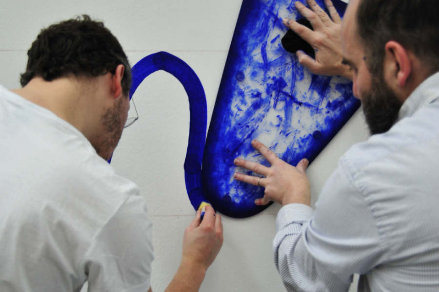
Working together for the first time, and using a bespoke, perspex drawing tool (similar to a french curve), the two have developed a specific technique to write huge type directly onto gallery walls, showcasing Raymond Williams’ fantastic ‘key’ words on which the show is based – including Folk, Violence, Criticism, Liberation, Formalist, Myth, Anthropology, Native, and Materialism. The aim of this writing style, “unlike a caption or a wall text” encourages the viewer to “actively produce his or her own meaning” to the words and artworks on display.
We asked Mike O’Shaughnessy, Senior Lecturer in Graphic Design & Illustration at LJMU, and delivering his own writing- inspired project with young people at Tate, to speak to them about this beautiful typography and how aesthetics, process and theory played a part in its design.
Mike: I heard that the type you’ve created for Keywords is actually based on Luca’s own handwriting; why?
Will: It wasn’t intentional at the start, but we needed something to refer to. Typically, because Luca is Italian Swiss, in Switzerland they have this amazing cursive from primary school. I think England’s one of the few countries where it hasn’t been taught.
When we started, Luca originally showed me this stencil type press from an Argentinean magazine [Nueva Vision, Revista de Cultura Visual, 1951]… He said, ‘I’d like to produce a typeface that is quite explicitly made in parts, made in segments’… When we were installing it at Iniva, Grant Watson, the curator, was also quite anxious that we should make it in a constructivist way, expose the construction of that writing, make it quite clear it’s been made up of different parts.
Mike: Words can never be perfect. When you actually see them on the wall, it’s a culmination of something personal that is made up of composites.
Will: But I think it’s the same as if you write something on a piece of paper; you’re reading it at a distance where its size has a certain relationship to you. If you look at it like that, you see its construction clearer.
Also, if you write something in handwriting it becomes subjective. That relates in one direction from a segment, to eventually a word, or a Keyword. It’s not just the interpretation of the word that’s on the wall, it’s the interpretation of every single line that makes that word, or even every single time that word is used in a different sentence or a different context. It’s constantly in flux, it’s constantly being transformed.
In private, if you’re writing you go pretty quick; if you need to make that public, it becomes disjointed and clunky and you build it up in a completely different way. So for me at least, there is that fluidity that is suggested in its production, from the K to the E to the Y to the W and so on, but it’s actually not fluid at all. The way we write it, you don’t just get a marker and write that on the wall; you need this clunky instrument in order for us to make it look like that.
Mike: It’s very controlled. Where’s the margin of error? You know what I mean; the sort of fear you have facing a white wall, that’s quite pressurised.
Will: Rehearsal in public makes it more fluid, more controlled.
Mike: It relates to [graffiti] tags in some way, and how tags are signature, and how each tag is practised. It’s a skill, and the more you practise, you’re going to nail it.
Will: That’s the thing, it’s like body memory; handwriting is really fast and responsive and adaptive and we take that for granted. We never stop and think about it… I really like the way that we’ve broken it down and made it into this really machine-like operation.
Luca: The size of the template requires two people. This relationship between the construction of the letter, the word and the body… In the artwork that we discussed initially, the type stencil from the magazine, the segments that made up the letters looked not exactly like bones, but like …
Mike: Joints.
Luca: Yeah, so you are thinking of joints. And we used some joints to actually write the words. It’s not heavy work, but it requires a kind of…
Mike: Synchronicity.
Luca: Yeah.
Will: And constant attention. It’s not like tagging; you start doing it subconsciously and then it becomes something else, that’s when it becomes beautiful. I keep coming back to this, what does it mean to translate that in public? And really make your artwork quite clunky and difficult and not subconscious.
Mike: Was the look intentional? Where the ink overlaps, you haven’t starved the ink; there’s a translucent quality, so it amplifies some of those points.
Luca: But also, this idea of ‘clunkiness’ invites further reflection on the word that is written.
Will: It’s important to emphasise that. I feel that everything we talk about needs to be understood in different scales. From a segment to a letter to a word into a sentence into a paragraph, every step of the way everything we’re saying applies in all of those conditions. You stop and think what a segment needs to be, in the same way we hope that people in this exhibition will stop and think what that word means, or stop and think what that word might mean in a sentence. It’s just about slowing things down I think.
Mike: I think it’s interesting that you both have made a transition between graphic designer and artist. So now, the typography that you’ve created is part of the work. You’re not facilitating an idea, you’re enriching the exhibition, the concept and the idea.
Luca: Is it drawing? Is it painting? Is it writing? I can’t decide because it’s all three of them together.
Will: I’ve never made that distinction in mark-making or writing or typography or someone sat writing an email; it’s still producing something on the screen or wall or surface.
Mike: You’re also using a very strong blue ink here directly onto very white walls; have you made any mistakes?
Luca: We’ve never corrected anything.
Will: Most of it was improvised while we were making it. We’re quite well-rehearsed now.
Mike: When drawing, the surface of the paper is very important. You get these ‘sounds’ from a surface, you can’t hear them but it’s there, and it’s how you react to the pressure of the pen. You’re using the wall as a surface here; do you ever make adjustments for that sort of thing, when you think ‘actually it feels different’? Do you ever think a surface feels right or wrong?
Luca: In Switzerland, for an exhibition at Kunsthaus Glarus, we did it on a wall whose texture was quite grainy. And it took us a day to adjust and then it went very well.
Will: It wasn’t quite like concrete but it was about as rough as that. It’s texture was that.
Luca: Then you start to think about the consistency of the sponge tip and the fluidity of the paint. It becomes very technical and it’s not exactly how we like to work.
Will: We had to be really persistent with ourselves and not give up. For the first few hours, you’re thinking of completely different constructions and different solutions, and different pens. Then you just have to start all over again, because it takes two days longer to test all of that. It started working but it was really hard work, it was really bumpy and lumpy, not smooth at all.
Mike: Often in handwriting there is a speed and a shortness. But you have to be deliberate in your work, and those nuances — speed and all those things — they are tiny but they make a big difference don’t they?
Will: Once we put the A too close to the L and we couldn’t get that loop, so we made it up.
Mike: The legibility too is, of course, important.
Will: Especially with these cursive Rs, not many people write them like that anymore, and it’s a practice thing to make those legible, they can be confused with other letters.
Mike: For my project SupaDudeyWords, I’m trying to get young people to look at formal handwriting; data says that they’re moving away from it because they’re using laptops, word processing essays, etc. It was inspired by Gerrit Noordzj’s The Stroke: Theory of Writing; early in the book, there’s this quote: ‘The frightening increase in illiteracy begins with the neglect of handwriting in schools.’
I’ve made them some drawing tools and they work with bespoke grids. If you force them to hold something differently, and if it fits in the hand, they’ll use it.
Will: But that’s the distinction we mentioned earlier; is it drawing, mark-making? What is it? I was teaching my niece and nephew calligraphy. He hasn’t learned to write, so he doesn’t make any distinction at all, and he’s producing the most incredible calligraphy because he just draws. He understands the tool and he starts drawing. Whereas she is trying to handwrite using a calligraphy pen and it’s just hopeless, useless. It’s because he doesn’t make that distinction. You give them a pen and they become over-conscious.
Mike: It becomes loaded with meaning. It’s a memory thing as well, muscle memory. Because if you haven’t used a pencil for a while, it’s like, ‘What the hell is this weird thing?’
Luca: I think it’s about that, but also about reclaiming language as something closely connected to one’s own experience of everyday life.
Mike: It’d be good to make young people less fearful and more self-expressive in everyday life. You’re fooling them in a way using grids and templates; you’re saying ‘This isn’t a drawing tool’, but actually it is; it’s just another type of tool, like the drawing tool you two have made (pictured).
Will: It’s not drawing, but it is that constant flit … it’s exactly what you’re putting the kids through. Reducing it to an abstraction until they become comfortable with it until they have become rehearsed and realise, ‘Oh fuck …’
Mike: ‘…I’ve written something.’ It’s interesting and beautiful.
Will: Yeah. It’s also the scale though. That huge scale implies something public, it implies an exchange. Writing this big so someone will see it from three metres away. It’s a massive implication, I feel.
Also taking out the digital transformation of work is important; you take that out of the equation and it becomes something manual. Everyone understands nowadays that all you do is put something under a scanner and you can blow it up to any size you want, that’s the fluidity. We are suggesting things need to be slowed down.
As told to Laura Robertson
Photography courtesy Laura Deveney at Tate Liverpool
Luca Frei is an artist based in Malmö and Berlin. Frei uses a range of media including installation, performance, drawing and text. His practice is concerned with the ways in which art might provide a measure of agency by creating alternative spaces designed to encourage free learning and emancipatory practices.
Will Holder (1969, Hatfield, UK) is typographer based in London. He teaches graphic design at the Gerrit Rietveld Academy in Amsterdam and was an advising researcher at the Jan van Eyck Academy, Maastricht (2004-2007).
Mike O’Shaughnessy is a Senior Lecturer in Graphic Design & Illustration at Liverpool School of Art & Design, LJMU. Illustration clients have included Vogue, Static Caravan Records, Universal Music and Elbow. Research Practice has involved the Alchemy of Drawing / Calligraphy, Perfume, Clever Words and Illustration Practice.
Keywords: Art, Culture and Society in 1980s Britain is now on show at Tate Liverpool until11 May 2014, £8/£6 entry fee. See site for a full list of talks, workshops and tours. Open daily 10am-6pm