Colour and Manipulation: Grey Crawford’s Chroma
More than forty years since Grey Crawford began his darkroom experiments that seem to anticipate digital aesthetics, the world is finally catching up and giving the conceptual artist his due, says Wayne Burrows…
There’s a myth in the art world that the route to success is originality – that the forward-thinking artist, making art that changes the game, will be rewarded with influence and success in the critical and commercial marketplace. In truth, though, the reception and understanding of actually original, rather than superficially innovative work keyed-in to niche curatorial trends, is generally delayed by decades. Even then, its existence is often the preserve of a kind of cult following – the domain of specialists or those with a particular tendency to dig deep or seek out the lesser known. There is rarely much wider public acknowledgement or recognition. David Bowie, to give just one example, was vocal and enthusiastic about crediting his various borrowings from Lindsay Kemp, Anthony Newley and others, but the public perception that all these previously established ideas and ways of working were entirely originated by him, and him alone, persists to this day.
Perhaps it’s less surprising than it might first seem, then, that it’s been more than forty years since Grey Crawford began his darkroom experiments with photographic masking and light exposures to create colour images that now seem to anticipate digital aesthetics and a whole range of decidedly ahead-of-their-time questions about image manipulation and the documentary truth of the photograph itself. As Crawford himself pointed out during a conversation hosted at the Beam gallery space – where some of the Chroma series prints were on display in 2021 – back in the mid to late 1970s, the idea that photography could interest a legitimate artist was only recently and tenuously established, and the bias even then was towards monochrome photography and the seriousness it appeared to aesthetically signify. Colour and manipulation were still seen as the preserve of fashion, advertising, and commercial artists, meaning no real 1970s context existed in fine art for Crawford’s own abstract, minimalist and Land Art inspired experiments in the medium.
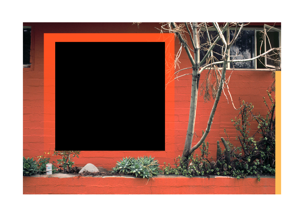
Perhaps the point is made most clearly by looking at Chroma in relation to Crawford’s slightly earlier Umbra series (1971–1978), often consisting of monochrome photographs of geometric sculptural pieces transported into Southern California’s deserts and streets, arranged and photographed. These, at least superficially, appear to fit the narrative of landscape photography and Land Art documentation – a series of images that neutrally present otherwise inaccessible or temporary real-world structures and objects in photographic form. Viewing these Umbra images, we might assume that the ‘real’ work, the subject of the image, is elsewhere – a minimalist black square physically present out in the desert somewhere – even as many of these squares, rectangles and rhomboid shapes turn out to be monochrome trial runs for the kinds of darkroom masking that would later produce the entirely conceptual colour suspensions, monoliths and signs that overlay the deserted urban fabric of Los Angeles in the Chroma series. The subject, in many of these images, does not always exist outside the photographic print itself.
Crawford himself notes that what context did arguably exist for this work was a specifically local one, as seen in the influence he acknowledges in the Los Angeles and California traditions of architecture and abstract painting represented by the West Coast hard-edge painters Karl Benjamin and John McLaughlin and the Mexican architect Luis Barragán, whose works were often grounded in inspirations from Pre-Colombian and Native American art. In these, as in Crawford’s Chroma, landscape is abstracted into patterns of colour and rhythmically repeated geometric shapes. This specifically Californian set of influences merged with the transitory 1970s urban landscape of Los Angeles itself, as the city’s older modernist factory, office and workshop spaces were abandoned, left disused or derelict, to await clearance and the glitzier neo-liberal redevelopments of the 1980s and after. These local factors work to give the Chroma series a distinct temporal and geographic grounding that might not always be immediately apparent to outsiders.
Apart from this local context, however, the works can often feel almost like projections backward from our digitally mediated present into a landscape that was still decades away from experiencing its transformations. It would be easy, in 2022, to casually glance at the images in Chroma and imagine them to be indistinguishable from the kinds of digitally photo-shopped or graphically manipulated prints we’re now all-too familiar with. The laboriously unprecedented darkroom experiments with analogue light exposures, cut-out masking and wet-printing – all producing uncertain results – that they were back in 1978 is hidden beneath their seamless surface appearances.
This makes Crawford’s detailed elaboration of the makeshift development of his unpredictable process in this book, highly technical as it sometimes is, essential to any real comprehension of the images that same laborious process was used to produce, as reproduced in the book’s pages. There’s also an irony, perhaps, in the contrast we feel between the technical process itself and its deployment to generate images with decidedly – if admittedly only subjectively perceived – quasi-mystical qualities in their sense of a spirit of place, as signs of a kind also seen in Navajo sand-paintings, European stone circles and Arizona rock carvings are overlaid onto urban landscapes.
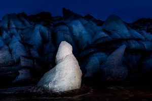
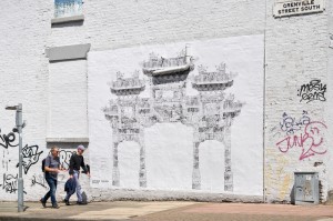
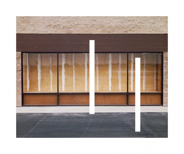
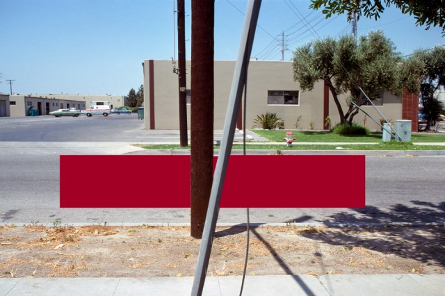
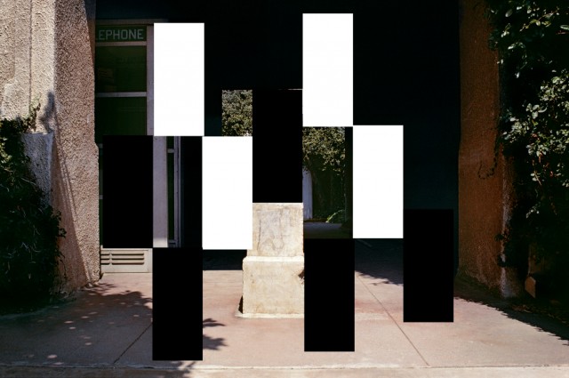
There’s a persistent sense in Chroma that these geometries and colour-codes might be read as an unknown, non-verbal language, like abstract pictographs, even as the dominant impression is of the many ways these imposed graphic forms emerge from or physically manifest within the urban fabric into whose photographic representations they are inserted. White lines masked onto the print echo the same forms in the studded wall set back inside an abandoned store-front window in Chroma #186 (1982) while a black square manifests as an improbably dark shadow inside its own roseate aura against the side of a red-painted house in Chroma #119 (1981). An elongated crimson barrier appears to levitate between the camera and a light industrial park in Chroma #29 (1978) while a lattice of black and white rectangles generate spatial confusion among the light and shadows surrounding a white marble sculptural seat and half-hidden telephone box in Chroma #103 (1980).
The sense of place denoted by the light in these images – explored and situated in its LA setting in a short text by Ashley Gallant in the book – is another powerful presence here, especially so when we understand how the masking and exposure process that generates Crawford’s geometrically altered photographs is itself a manifestation of the same light that heightens the textures and natural colours of the urban geographies seen in the photographs themselves.
Given all these complexities and subtleties around technical process, socio-economic meaning, local texture, and cultural influence in these images, perhaps it’s not so surprising as it at first appears that it took more than four decades for the significance of these photographs to begin to be more fully appreciated. After all, the art world has a tendency to simplify its own narratives of progress and rely on limited institutional perspectives that take in work from only a small number of international centres, with even those seen very partially and through the lens of mostly reactive curatorial fashion. Perhaps if Crawford had made Chroma in and about New York or Berlin, these images might have found their way into at least some art world and photography conversations, alongside the works of Bernd & Hilla Becher or Gordon Matta-Clark.
If factors like these have all likely contributed in part to the relative invisibility of Crawford’s images in the several decades since they were first made, perhaps it’s also the case that their anticipation of the changes that the rapid transition from analogue to digital media would come to effect in the nature and function of the photographic image from the 1990s onwards, could really only be noticed or understood once those changes had already taken place. At this stage, it’s to Crawford’s benefit that wider shifts away from traditional views of photography’s role as a truth-telling medium, and a public embrace of both broader accounts of the photograph’s development and purpose, and its legitimacy as a conduit for fine art, help clear the space for Chroma to be finally, if belatedly, seen.
Wayne Burrows
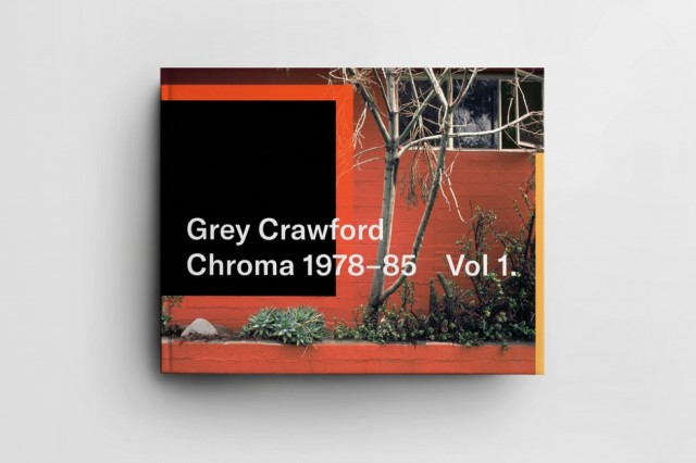
Images, from top: Chroma #119 (1981); Chroma Vol.1; Chroma #186 (1982); Chroma #29 (1978); Chroma #103 (1980)
Grey Crawford – Chroma Vol.1 (1978–85), published by Beam Editions, 2022, is available now