“I am in love with colour”: In Physical Reality With Liz West

Currently enjoying her first solo exhibition in Finland, artist Liz West talks to Laura Robertson about being deeply in love with colour: on creating vivid sensations through hue and saturation, and the technical lengths she is prepared to go to in order to “mix colour in space”…
Liz West holds an iridescent circle up to the webcam, moving it back and forth so I can see it sparkle. It’s a small sample of dichroic glass, invented by NASA and one of West’s favourite materials. She shows me two varieties: a warm hue, which ripples from yellow to pink, and a cold spectrum of blue to green. “With normal glass, you obviously see through it, and it either has a green tinge or it’s clear. Dichroic glass has a wonderful quality. When you move it around the colours change, like the iridescence of a butterfly wing. It’s incredible.”
West’s art evokes the sensations of colour. The 35-year-old British artist’s sculptures and installations have delighted audiences all over the world. Colour affects her spirit, and through her work, ours. She is intoxicated by the science, history and theory of colour. Previous works have condensed the essence of a sunset; deconstructed Sir Issac Newton’s seven-colour rainbow; and made entirely new hues from the Munsell Farnsworth 100 Hue Colour Vision Test – a method typically used to check colour blindness.
The artist confesses, unsurprisingly, to being “obsessed with materials”. During our interviews – held by video conference because of the UK’s Covid-19 restrictions, despite us living barely 45 miles away from each other in the North-West of England – she manoeuvres her computer screen so that I can see the studio cabinets behind her. She opens drawers and starts to remove a steady stream of miscellanea: colour swatches, spreading them out in her hands, one by one, like Japanese folding fans; paper samples in various weights and shades, from a sheaf of thick white matt to shimmering metallic; a keyring of fluorescent Perspex rectangles; metal brackets, bespoke fixings; and more dichroic glass circles, loose like coins.
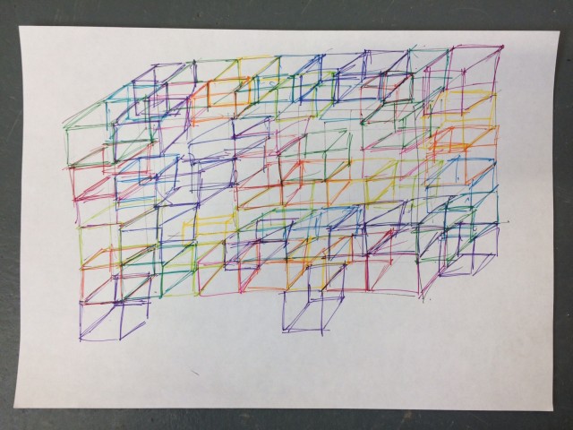
Out of more drawers come sketches for works-in-progress and completed commissions. I recognise a drawing for Iri-Descent, lightly outlined in coloured pen (more on that later). These works on paper are surrounded by copious, neat handwriting and collage, too, using tiny pieces of foil and vinyl. They suggest to me a sense of West’s process, one that is careful, meticulously organised and engineered down to the last millimetre. “I am an absolute control freak. I like to know what’s happening and when. And if I don’t know, I feel quite disorientated and stressed.”
West is smiley and direct. She uses her hands to describe things. For our interviews she wears a simple vest top and jeans with her hair tied back, ready to work. She seems like the “practically minded” person she says she is, who becomes animated and increasingly confident when discussing how she executes her techniques and processes.
It is clear that West enjoys collaboration. It is, in fact, very necessary in order to realise her ideas – she needs complex machinery, designers, engineers and fabricators to deliver her large-scale sculptures. “Sometimes being on your own in the studio is quite a lonely pursuit. For me, working on the bigger projects with teams of people can be enlightening, because everyone’s come to the table with their own experiences and ideas, and people are generally very generous.”
But she does have to trust who she works with. She is involved in every stage of production and “oversees each element in scrutiny”. West loves to work with a particular team of fabricators called M3 Industries based in nearby Salford, Greater Manchester. Scroll through West’s Instagram and you’ll see many images of her artwork being tested and built in their workshop.
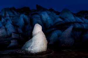
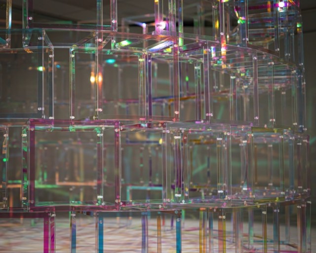
Most recently, new sculpture A Familiar Variant has been created especially for the In Physical Reality exhibition at Hyvinkää Art Museum, Finland. It is West’s first solo show in the country and will present three major works to the public. When we last speak, she has just shipped the six-foot cylindrical sculpture to the gallery. Visitors will be able to walk around it and slot themselves into a colour wheel of transparent, polyester-coated polycarbonate panels. As the light shines through the primary and secondary colours and the panes overlap, we will ”see the colour mix happening in space.”
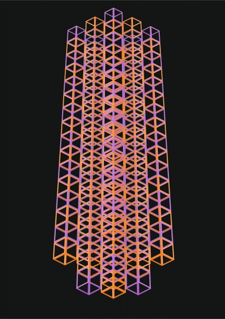
West’s aforementioned Iri-descent has evolved over a longer period, and gives insight into to the problem-solving skills central to her practice. Originally commissioned by Britain’s famous upmarket department store, Fortnum & Mason, London, in 2019 as an installation for their great hall, West initially envisioned the artwork as “a cacophony of suspended modular cubes” in her beloved dichroic glass. The idea would prove “too heavy and too expensive”.
Collaborating with the company who construct Fortnum’s Christmas decorations, West navigated the difficult space – busy with lavish architectural detail and merchandising – to eventually create a “massive” yet lightweight, extra-terrestrial-looking, nine-column suspended sculpture. This work has been deconstructed, shipped to Hyvinkää and rethought in “a new form and shape, throwing out all kinds of multi-coloured refractions on the new white carpet.”
A Familiar Variant and Iri-descent, along with West’s hugely popular touring work, Our Colour Reflection (2016-20), will be showcased across two rooms that will “awake the senses.” West hopes that Iri-descent in particular will respond to “the darkest months” of the severe Finnish winter. “That vivid colour and illumination that comes from the work, it’s almost needed at that time of year – as soon as you point a spotlight at this piece, it’s just going to ping like a jewel.” West suffers from Seasonal Affective Disorder (SAD) and has “had many conversations with Finnish people about what it’s like to live there”.
We both miss Finland, having had the privilege of visiting separately many times, and were each planning on returning earlier this year before Covid scuppered our plans: me to Helsinki Biennial on Vallisaari Island, and West to oversee install in Hyvinkää.
Over the course of our conversations, it becomes clear that, rather than something restricted to her artworks, West is an expert on the experience of colour. For her, the gamut of shades in her installations – including the three key spectral colours, electric reds, violet- blues and spring-greens – are personal. In the precise quality of the structures, they become anonymous, or in other words, allow us to lay our own associations onto their surfaces.
I’m reminded of what author Maggie Nelson says about us turning to colour in particularly fraught moments (explored in 2009’s Bluets). We are all aware of one such colour in our lives; for me, it’s the melancholy blue-brown of the turbulent river Mersey. A book that West turns to again and again is David Batchelor’s The Luminous And The Grey (2014), in which he talks about the vivid colours of the city, and how they coexist with a degree of darkness. I think about the metallic kaleidoscope that West recently produced for Paddington Central’s Westway Bridge in London, and the people that must pass it at all hours of the day and night, in a city that never sleeps, and take comfort from its prism.
The artist’s most vivid memories of colour are from her childhood during the 1990s in Barnsley, South Yorkshire. Like being in the car with her parents (who are both artists themselves) and seeing fast-moving reflections of neon signs bouncing off on rain-soaked pavements. The colours, sights, smells and sounds we sense as young people stick with us through life – and have the jarring ability to take us back there without warning.
West perhaps feels this more than some. “My world is quite a noisy place. From being very young, I’ve been a super, super sensory person. I was incredibly fussy with food, the textures frightened me, and they still do. Being in a busy room with different conversations going on was quite overwhelming.”

She says she is “plugging into this world, and then making work about it.” One of the ways that she does this is by deliberately employing a limited palette, and controlling her environment with rules and systems. West chooses only the hues available for the material she’s utilising for each project. She eliminates blacks and browns and other colours that she says don’t appeal. With digital editing software, she selects the highest line of saturation in order to determine the best combinations.
“I want to see the highest line as it limits my palette from millions to hundreds. I do the same with artificially-lit pieces. People ask me why I don’t use LEDs more often in the work, and that’s because you can do anything with them, whereas a fluorescent glass light tube comes in 2, 3, 4, 5, 6 or 8-foot lengths, and three different thicknesses, T5, T8 and T12, and that’s it. I love that.”
There’s a huge degree of subtlety going on in West’s relationship with colour. She wields it as a device to pull you in, and once there, her work holds you in an intense chromatic space that references colour as a subject, a fixation, and a memory aid. As an artist, she recognises and respects the appreciation for colour in others, too. “It’s about a deep understanding and a deep love of it. I am in love with colour.
“Some people are afraid of colour. Some people just know it exists and it’s in the world around them, they don’t think too much about it. But I’m in love with it. And when you’re in love with something, you find out everything about it.”
Laura Robertson
See Liz’s first solo exhibition in Finland, In Physical Reality, at Hyvinkää Art Museum until 28 March 2021
Open Tue−Thu 11:00−18:00, Fri−Sun 11:00−17:00 – adults €6, pensioners and students €5. Free entry for children and unemployed, and on Wednesdays 16:00−18:00
Images from top: Liz West, A Familiar Variant, 2020 © Jussi Tiainen: Hyvinkää Art Museum. Sketches for Iri-descent, 2019, courtesy of the artist; Iri-descent installed at Hyvinkää Art Museum, courtesy Aleksi Nurminen, with thanks; Our Colour Reflection & A Familiar Variant, 2020 © Jussi Tiainen, Hyvinkää Art Museum