French New Wave: A Revolution in Design – Reviewed
Much has been written about the French New Wave, but what of the posters created in response to the movement? Mike Pinnington investigates a new book dedicated to designs as innovative as the films they were made for…
Bardot, clad in dark glasses, stares blankly and nonchalantly past you, as if she’s just stepped out of Warhol’s midtown Manhattan Factory. You can imagine the scene. Still reeling from sitting for a screen test and an unwelcome, icy encounter with Nico, the look tells you she’s better left to her own devices, to cool down over a glass or two of champagne – reputedly her favourite tipple. It would be a brave soul who disturbed her that afternoon. As images evocative of an era go, you could hardly hope for one more striking or resonant.
In fact, although chronologies align almost perfectly, this picture isn’t a product of Warhol’s New York at all; indeed, to the best of my knowledge, Brigitte Bardot was never – unlike the VU chanteuse Nico, for instance – the subject of the implacable pop artist’s infamous screen tests. (She was, eventually, immortalised by Andy in eight paintings almost a decade later.) Rather, it is a poster for Jean-Luc Godard’s 1963 film, Le Mépris (Contempt). Godard, along with Francois Truffaut, Claude Chabrol, Eric Rohmer and Jacques Rivette, emerged from the ranks of Cahiers du Cinéma, a French film criticism magazine launched in 1951. It attracted a raft of writers in love with film who also aspired to be directors (often resulting in film serving as criticism – and vice versa).
Together (in the loosest possible terms) with their contemporaries, the more politically inclined Left Bank directors of Alain Resnais, Chris Marker and Agnès Varda, they made up what was quickly christened the nouvelle vague, or new wave. Marked by auteur theory and united in railing against – as they saw it – the staid ‘le cinema du papa’ of the previous generation, the French New Wave’s imprint and legacy remains. It continues to be studied in universities, has spawned various critical volumes and for many is the high-water mark in cinema. A new book on the subject, however, turns its attention to the posters of the era, which brings us back to that Bardot image (below). Made by Janusz Rapnicki, a Polish designer prolific in the mid-60s, it is just one of many achingly cool examples of the form recently pulled together for French New Wave: A Revolution in Design (Reel Art Press).
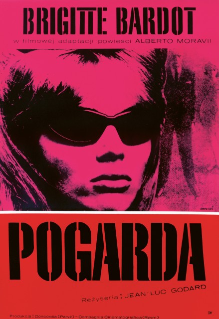
More ambitious than many a coffee table book (often produced more-or-less merely for decorative purposes), it has an internationalist outlook and is organised around the individual poster designers rather than films – a real bonus, as we get to see multiple, wildly contrasting treatments of the same movie. These different versions betray the influences, trends and sometimes politics dear to their maker, each of whom is treated to a short but insightful text by way of intro. These tidbits regularly shoot off in the direction of other references, opening the doors to seemingly unrelated worlds of design genius. We learn, for instance that, while little (besides his body of work) is known of Rapnicki, his poster for Le Mépris while of course a ‘tip of the hat’ to Warhol, is also indebted to Blue Note Records’ Reid Miles.
Many of the designs are infused with and invoke the energy central to the films they were commissioned to help market. Unsurprisingly, then, vibrancy and innovation leap from every page. The most celebrated and widely known films of the New Wave are all here, with multiple entries for the likes of Jules et Jim, Hiroshima mon amour, À bout de souffle (top) and Les Quatre Cents Coups – I could go on. As Sir Christopher Frayling notes in his expansive and informative introductory essay, “At their best… these posters amount to a revolution in design, just as some of the films amounted to a revolution in film.” The book, he continues, shows “how far national campaigns differed from one another sixty years ago”, emphasising today’s tendency toward “global digital marketing campaigns, with graphic devices which are re-usable in a variety of formats; when distinctive poster identity is becoming an endangered species.”
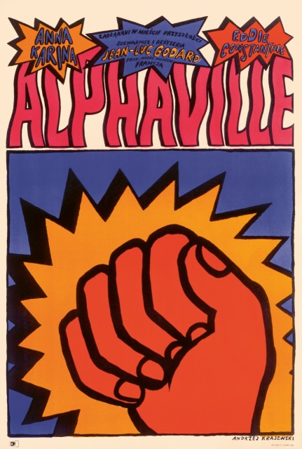
Nowhere is this more obvious than with Godard’s 1965 Sci-Fi-noir, Alphaville. Across numerous versions (more than any other film here, in fact) we see the work of artists whose nationalities include Argentine, Danish, Polish, Italian, Czechoslovakian, Japanese and, of course, French. This geographical range is matched almost by stylistic takes. Pino Milas posits Alphaville’s gumshoe protagonist Lemmy Caution looming over us, gun drawn, in red and black; Andrzej Krajewski’s, meanwhile (above), tends to the more colourful, comic book vibe of pop art with a cartoonish clenched fist. Krajewski stops just short of including words such as ‘blammo’ and ‘kapow’, though you feel he was tempted.
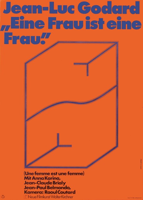
Some of my favourite examples are more abstract in tone, and today they would no doubt leave marketing departments and audiences alike scratching their heads, so pared down are they. One such poster, by Hans Hillmann (above), is for the German release of Godard’s Une Femme est une femme. Known for his minimalism, Hillmann had a long-running relationship with Godard, for whom he designed eight posters. Here, he uses a limited palette to suggest – as simply as possible – aspects of the female form. At the other end of the scale, Georges Allard’s treatment for Le Mépris opts for a traditional, figurative approach. Accentuating Bardot’s sensuality, and leaving little to the imagination, the gaudily Technicolor effect hasn’t aged well and wouldn’t look out of place on the cover of a Mills & Boon.
But this is a rare exception amongst dozens of examples assembled to produce a sumptuous and enlightening publication, one which will make you yearn for more imaginative design the next time you open a film magazine or visit the multiplex.
Mike Pinnington
French New Wave: A Revolution in Design is available now from Reel Art Press
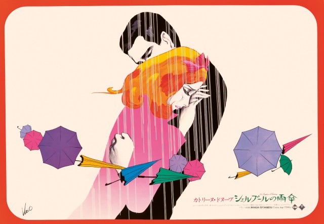
Images, from top: À bout de souffle (1960), artist’s proof for British quad sheet Peter Strausfeld; Le Mépris (1963), Polish one sheet Janusz Rapnicki; Alphaville (1965), Polish one sheet Andrzej Krajewski; Une Femme est une femme (1961), German one sheet Hans Hillmann; Les Parapluies de Cherbourg (1964), Japanese horizontal one sheet Kazuo Kamimura