“An ingenious distillation of the graphic language of fast food”: Bad Scouse — Reviewed
Is pizza a shared language? Jade French takes a seat at the Tžužjj table, and finds artist and designer Mark Simmonds breaking down fast food into beautiful, abstract diagrams…
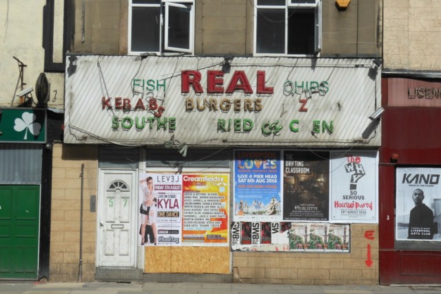
According to my nan, there’s no such thing as bad scouse. That’s because scouse (what we call stew in Liverpool) is incredibly personal, and most Liverpudlian families have their own guarded recipe, passed down through the generations. Beef or lamb? Cabbage or beetroot? You’ll only ever really like your own. And for the record, I’m in the beef with beetroot camp. One Sunday evening a few weeks ago at Cow&Co Cafe, “blind scouse” (vegetarian) is on the menu, and as I eat, I’m listening to artist Mark Simmonds recite the menu from a takeaway called Crispy Cod on London Road. Part dinner, part performance, part publication, this is Simmonds’ latest project: Bad Scouse.
Mark Simmonds is a designer. But as I came to discover, it’s not quite as simple at that. Working mainly on book projects, his practice explores the mutual ground between graphic design, literature, publishing, performance and art. He has lived in London and Berlin, and is currently based in Liverpool. He graduated from the Werkplaats Typografie, Arnhem, in 2012, and has recently worked with Liverpool School of Art and Design, The Double Negative Magazine, and The Royal Standard (where his studio is based).
Commissioned by Tžužjj, a curatorial project between Louis Palliser-Ames and James Harper, Bad Scouse was a unique event hosted by The Cow&Co Cafe, comprising of a three course vegan meal, a performance, and an exclusively editioned publication for each of the guests. “I was approached to produce a book”, explains Simmonds, “which could be presented and connected to a meal”. Consequently, Bad Scouse draws inspiration broadly on the presentation of familiar food.
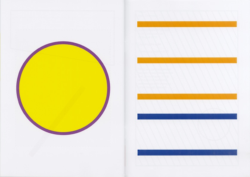
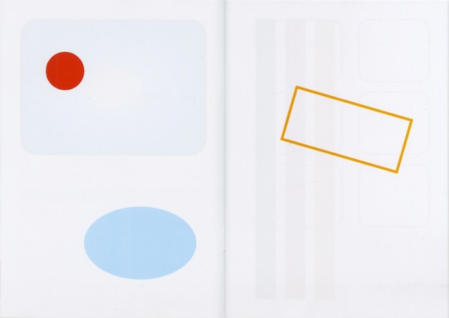
Upon arriving at the event, I was welcomed with a drink and a curious faux-leather, A5, burgundy Menu — like the ones you find in budget bistros — delicately screenprinted onto, with a photograph of the “Williamson Kebab Tunnel” (yes, it is in the Williamson Tunnels, and it does look like a kebab), and a beautifully printed, glossy, 32-page booklet. On the surface, the publication appeared incredibly simple; crisp white pages, punctured with colourful graphic shapes. But there was more to meet the eye.
Meeting him at his studio post-event, Simmonds explained: “The publication is illustrated with fragments copied from local takeaway menus. In removing any clear associations like text and photos, these isolated geometric forms somehow become beautiful, abstract diagrams and assemblages, quite formal, and to some would allude to tropes of modern art and design.” Back to the takeaway menus themselves, Simmonds continued: “I like how they look and feel, and how they are always the same yet always different. I hold them up as perfect examples of a particular form of vernacular communication.” It struck me that Bad Scouse is an ingenious distillation of the graphic language of fast food.
I wondered how the book’s unique content had developed. “As a designer, I work within constraints, such as budget, format, colour, page count – practical things”, Simmonds explained further, as he poured through a crate full of takeaway menus. “But also the constraints inherent in the content itself. I usually work with existing or found text and images; be it things provided by a collaborator or stuff that I’ve gathered myself, and I often integrate typographical idiosyncrasies from ephemera and books, things around me.
“I’m interested in how the editing and processing of this material can suggest new meaning, perhaps leading to alternate narratives and unexpected points of departure – which to the casual viewer may at first glance go unnoticed, or seem nonsensical and absurd. This way of working is the same for each project I work on; I am sifting through information, looking for details to exaggerate”.
Similarly, Mark speaks of prolific English typographer Antony Froshaug‘s playful description of the design process as translating something into another language, into another sign system, “with love.” After eating scouse at the event, the lights went out and the restaurant was illuminated by the light of an old overhead projector. Simmonds began reading aloud a takeaway menu, whilst arranging colourful geometric shapes onto the projector screen. “Cheese and tomato pizza… Cheese and tomato and mushroom pizza… Ham pizza… Ham and pineapple pizza… Chef’s special pizza…”
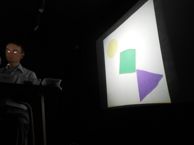
This performance, or “reading” as Simmonds describes it, focuses on the minutiae of food. It intentionally slows down the fast food experience. During the reading, there were moments where it seemed practised, even rehearsed; and it dawned on me this was not simply a reading of a menu but a carefully constructed process. Indeed, Simmonds revealed that the text was edited allowing the pace and rhythm of the presentation to mimic, in part, the structure and reading of a book; there were dense (or loud) chapters, sparse (or quiet) chapters, blank (or silent) pages, and so on; the choreography highlighting the often bizarre juxtaposition and repetition of words and the abstracted forms they symbolise, suggested through the illuminated cellophane shapes which appeared sporadically on the wall. Could a triangle be a slice of pizza? Could a circle be a burger? A rectangle a chip?
After hearing the usual suspects read from the takeaway menu — pizza, burgers, chips, kebabs — it was interesting to get to a Greek section. Was this intentional? A shadowy reference tying the project together, for Simmonds at least, is a book called The Mythological Travels by Romanian artist and writer Daniel Spoerri. An enduring touchstone informing Simmonds’s practice, in his studio he shows me a dog-eared facsimile of the book, published in 1970 by Something Else Press.
Drawing on Spoerri’s preoccupation with magic, mythology and the symbolism attached to mundane words and objects (see An Anecdoted Topography of Chance (1962)), Spoerri travelled to a Greek island to compile a culinary diary and recipe book of local delicacies, as well as writing histories of found objects along the way. It was a happy coincidence for Simmonds that The Crispy Cod serves Greek dishes.
After paying fifty quid for a ticket to the event, the food needed to be good, and (gladly) I wasn’t disappointed. A delicious mushroom and walnut pate to start, and blind scouse for the main; but what really clinched it was the dessert. A clever chocolate kebab, complete with sweet pita-like bread, chocolate shavings for the doner meat, fruit for the salad, and topped-off with raspberry and coconut sauces in ketchup bottles. Heston Blumenthal, eat your heart out.
Whilst the food began as the focus for the evening, it certainly didn’t stay that way. For me, the most memorable aspect of Bad Scouse was witnessing the distillation and transformation of colour, shapes and words into a distinctive shared language; which, crucially, only the attendees are versed in. I believe this feeds into Tžužjj’s carefully crafted experience; that I’ve bought — both conceptually and literally — into something rare and unique.
I was pleased to hear that Simmonds’ experimentation with the relationship between text, image and language is ongoing, and he is currently working on the design of a book for an Autumn exhibition the Bluecoat, entitled Auto Agents. Tžužjj also intend to continue commissioning dining events, as a way to showcase artists work in an intimate, and perhaps slower, environment. It’s an exciting format that could yield some unique experiences, but at the £50 mark, is this just too exclusionary for most people? Tžužjj think not. For them, the experience is part of an attempt to develop a new way of buying artists work, and as they describe it: “Building a buying culture for art in Liverpool”.
Jade French
See Auto Agents — and Mark’s accompanying book — at the Bluecoat, Liverpool, from 26 Novemember 2016-15 January 2017 — FREE