Where Have I Seen This Before? Robert Longo’s Men In The Cities
What makes a pop culture icon? Mike Pinnington on the serendipity of Robert Longo’s most influential – and most imitated – work…
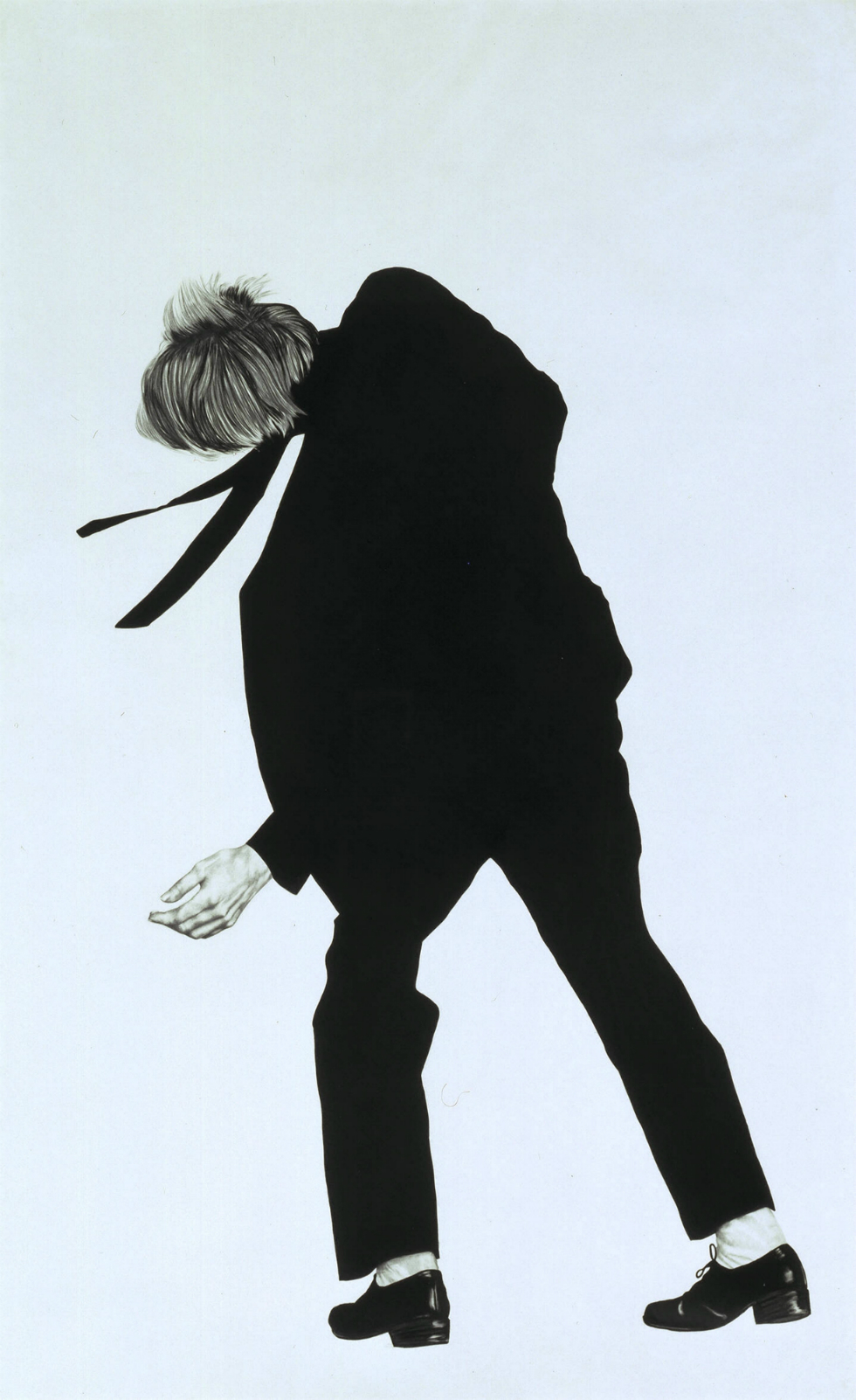
Walking past Untitled (Joe) 1981 as it was being installed on the second floor of Tate Liverpool, I did a double take. The sharp suit, skinny tie, and because we see ‘Joe’ from behind, I also envisioned a crisp, white shirt – these are staples of men’s fashion, but it wasn’t the attire alone that resonated with me. It was the combination of suit and pose; Joe, quite oddly positioned, seems off balance or in mid reflexive or exaggerated manoeuvre. Perhaps even dancing. It was that last point that finally made sense of my initial peculiar sense of familiarity – what the image most suggests, to me at least, is David Bowie, mid-sway in his late ‘70s pomp.
The drawing in fact belongs to Robert Longo’s series of large-scale works called Men in the Cities, in which suited figures, derived from photographs taken by Longo of friends, are depicted against blank backgrounds. He has said of the figures that: “I chose them to wear shirts and ties and dresses because most of the punks and No Wave people that I knew were dressing like this; this is the way I was dressing back then… so it became like a uniform.”
The awkward postures stem from Longo having been inspired by German film director Rainer Werner Fassbinder’s The American Soldier (1970), the final scene of which depicts a pair of gangsters gunned down in a hail of bullets. So, when I thought Joe was dancing, he kind of was, only to the tune of an unseen gunman.
That the image originated with a fragment of hip New German Cinema is apt: Longo’s Men in the Cities series (of which about sixty iterations were produced between 1979 and 1982) has gone on to have a long and successful lifespan, freeing itself from the gallery and becoming a cool, pop cultural signifier in the process. These, most often, are direct references, or by Longo himself operating in guises other than fine artist, but occasionally they are uncalculated, serendipitous even, chiming with what he said about the look becoming “like a uniform”.
So, if the image resonates or crackles with familiarity for you as it does me, where else might you have seen these remarkably well-travelled Men in the Cities before?
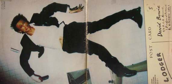
David Bowie: Lodger (1979)
Derek Boshier
Released in the same year as the first of Longo’s Men in the Cities appeared, the sleeve for Lodger has a bashed up-looking David Bowie replete in black suit and white shirt unceremoniously sprawled across the floor. It’s an incredibly evocative and memorable image from British artist Derek Boshier, who in 2003 explained Bowie’s curiously contorted staging: “The cover for Lodger was a collaboration between David, the photographer Duffy, and myself. I loved this solution to the problem of David being photographed falling. Shooting him from above, on a specially made table built to match the falling form.”
This collaboration Boshier speaks of resulted in what is without doubt one of my favourite record sleeves.
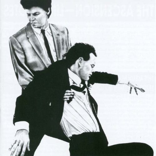
Glenn Branca: The Ascension (1981)
Robert Longo
Describing the narrative of the sleeve art for The Ascension, musician Glenn Branca (himself part of the No Wave scene) has said that he had wanted to show two men having sex, and had asked Longo to “make an implication of this”. What Longo gave him instead slipped beyond what, for the time would have been subversive, into darker territory: a depiction of Branca dragging the limp body of another man. Longo has said of his work: “I think I make art for brave eyes. I don’t want to make art that will pat you on the back and tell you everything is going to be okay.”
Coincidentally, in an article for Vanity Fair in 2003, Bowie said that, with this sleeve: “Robert Longo produced what is essentially the best cover art of the ‘80s (and beyond, some would say).”
New Order: Bizarre Love Triangle (1986)
Robert Longo
Longo’s interest in music led him to direct videos for, among others, Megadeth and R.E.M. In 1986, he was behind the camera for New Order’s single Bizarre Love Triangle, which featured a man and a woman in those – by now pervasive way beyond the world of No Wave – business suits.
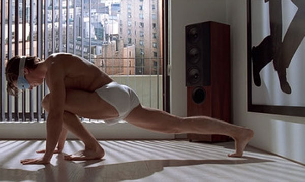
American Psycho (2000)
Mary Harron
A cultural as well as literal carnivore, Patrick Bateman is the titular psycho-killer of the Hollywood adaptation of Bret Easton Ellis’s American Psycho. Set in a world of ‘80s consumer and material excess, affluent New York executive Bateman has a pair of Men in the Cities lithographs hanging on his apartment wall. Good taste knows no bounds, it seems.

LCD Soundsystem: This is Happening (2010)
Ruvan Wijesooriya
Bringing the Men in the Cities (almost) up-to-date is yet another piece of album sleeve design. This time for LCD Soundsystem’s 2010 record, This is Happening. On the cover is James Murphy, the band’s creative force, shot by photographer Ruvan Wijesooriya, whose words sum up the success of what arguably remains Longo’s most celebrated work:
“Any image with a suit and a f**king skinny tie automatically conjures up those works of Longo. My reference wasn’t as intentional as it was unavoidable. When we were shooting this, we were both like, ‘Okay, we have the skinny tie and the suit; let’s go with the Longo reference.’ However, there’s other ’70s references in there that I feel are as present, such as Derek Boshier’s cover for Bowie’s Lodger album – the graininess of the 3200-speed film, the upside-down, turned-around thing.”
Having infiltrated an astonishingly broad spectrum of popular culture speaks to Longo’s ability to spot and make an incredibly iconic image. It is hardly surprising, therefore, that the cool guy depicted getting shot at on the gallery wall at Tate Liverpool struck so strong a chord with me. Longo’s almost inescapably successful images, that Wijesooriya referred to with a degree of resignation as “unavoidable”, will – it seems inevitably – spark various, sometimes interconnected recollections, associations and memories with many people, and for diverse reasons.
For me, Joe instigates a jolt of recognition each time I pass through the gallery, usually resulting in the firing of my internal jukebox – which at the moment, and it seems only right, is tuned exclusively to Bowie.
Mike Pinnington
Dedicated to the memory and genius of David Bowie (1947-2016)
A version of this article appeared originally in Tate Liverpool’s new seasonal publication Compass. Available for £1, exclusively at Tate Liverpool, it features articles and essays exploring exhibitions on each floor of the gallery. Find out more information about Compass here
Robert Longo’s Untitled (Joe) 1981 forms part of the free Constellations displays on the first and second floors of Tate Liverpool