World Cup Clichés: Graphic Design’s Approach To Football
Should we be showing graphic designers the yellow card for producing the same kind of World Cup artwork? Ian Mitchell explores the visual clichés and asks: are designers manipulating them or being driven by them?
In years gone by, the arts used to be an alternative to and a sanctuary from the World Cup. For instance, to coincide with the sporting festival it was not uncommon for the local independent cinema to put together a patronising seasons of chick-flicks for football widows.
However, for the past two months it has been impossible to escape football, FIFA or anything to do with Brazil; whether you’re buying your groceries or flicking through a Sunday newspaper arts supplement. World Cup tie-ins, product placements and ‘creative’ collaborations have been everywhere.
So how have the creative industries, and in particular graphic designers and illustrators, responded to the FIFA World Cup 2014? Have they added to this media saturation with anything particularly original or ambitious?
At this point I should disclose a personal interest.
Many months ago I, and my colleagues from the Graphic Design and Illustration programme at Liverpool School of Art and Design, had the idea of producing a football-themed exhibition and publication to coincide with the World Cup. However, as some of us weren’t that interested in football, we set a more inclusive challenge for ourselves by finding a text critical of the beautiful game that could act as our brief. We found an essay entitled The World Cup and Its Pomps, written in 1978 by the famous Italian semiotician, intellectual and writer, Umberto Eco.
Published in his collection of essays Travels in Hyperreality (1986), Eco linked football “with the absence of purpose and the vanity of all things” questioning the corrosive banally of its punditry, its inherent prejudice and exclusivity and its (a)political morality.
As the media-saturation intensified, it became the catalyst for our new-found anti-football direction, culminating in an exhibition and publication launch at Bold Street Coffee on the day after England were knocked out. Most of the artwork we produced avoided the usual signifiers of football and successfully illustrated specifics themes explored in the Eco text.
The exhibition pushed me to look closer at the responses from other graphic designers and illustrators. The World Cup has certainly given makers across the creative industries an opportunity for new commercial work; some of which was featured in Creative Review’s World Cup Special Edition. However, like us, many have also taken the opportunity to initiate their own projects, interpreting the World Cup free from the restrictions of a client or a clear commercial objective.
Exhibitions of World Cup posters and graphic ephemera of various forms were the obvious manifestation. The National Football Museum quite naturally focused on this, as did The Proud Archivist, whose exhibition featured on the BBC’s prime time One Show. The National Football Museum attempted to look a little more speculatively at the how football can inspire design with their collaboration with MMU, Mandacuru Design and Instituto Plano Cultural with the exhibition Brazil+Football+Design.
Most of these exhibitions had shared characteristics, which suggest that we aren’t as original as we like to think we are, despite often calling ourselves creative. For instance, most exhibitions were launched on 12th June to coincide with the opening game. Several (including our own I Don’t Love Soccer project) included teams of eleven contributors and used team formations as playful formal elements in the curation and organisation of work.
Some good examples of this were KK Outlets First Eleven exhibition that explored the transformative power of the football shirt by bringing together a collection of bespoke kits designed by leading artists and designers; the You’re Sh*t Arrrgh! exhibition of 11 artistic positions on football; and Pickles quarterly independent football magazine, whose World Cup edition featured eleven previously unseen articles. Even the V&A were at it with an arbitrary and downright baffling use of the team sheet metaphor to arrange their collection during the World Cup.
In the North-West, there were also a number of notable ventures by our leading creatives, that dare I say took advantage of the World Cup for some commercial or self-promotional gain. Camp and Furnace in Liverpool had a photographic exhibition in association of with Mundial Magazine and Offside Sports Photography to go alongside the obligatory Brazilian street food and big screen in their fan park.
Studio DBD from Manchester collaborated with Barcelona’s Studio Hey to produce a book of World Cup characters called Gol!, featuring illustrations of players in Hey’s minimal, geometric illustration style. And in Liverpool, we’ve had Uniform’s 32|64|90 which pits creatives from around the world to respond in real time to each match; and Splinter’s Animal Allstars – a World Cup sweepstakes postcard set that featured illustrated animals to represent each country.
Both these last two projects are beautifully executed, engaging and sociable, and shouldn’t deserve criticism for any self-promotional side effect. They are joyous celebrations of the World Cup, just like most of the other projects featured in this article.
But this is the problem.
In all the excitement of an international football tournament, and all the possibilities it brings for creative minds, there is a tendency to forget to look a little closer and deeper at what we are so willing to celebrate. Yes, we might love the prospect of trying to watch three games of football for 10 solid days. Yes, we love the colour of the occasion and the visual peculiarities of different national shirts, badges and flags. Yes, we get misty-eyed when we see a Panini sticker album from that tournament from our childhood.

Yet what about the less positive aspects of the World Cup? Even if you don’t know much about football, most people will be aware that its governing body FIFA has some rather dubious practices. The civil unrest from the Brazilian public over the event’s financial burden has been widely reported (and recorded in its street art). A cursory reading of the history of the World Cup uncovers all sorts of shady goings on, where a succession of tournaments have been played out within some very nasty political contexts. Out of 800 players brought to the World Cup by their countries this year, not one is known to be gay. As a whole, many graphic designers and illustrators choose to ignore the more political issues of the game.
And why would we want to criticise and focus on the negatives? That’s not going to sell many posters, keep people coming back to our website, or lighten the mood at the bar at the fan park. But we miss the opportunity to say more. Ironically when so much of what graphic designers do in the field of branding and identity is underpinned (or sold) using the role of research in the design process, when it comes down to working with the freedom to author our own messages and not others, research and investigation are often overlooked.
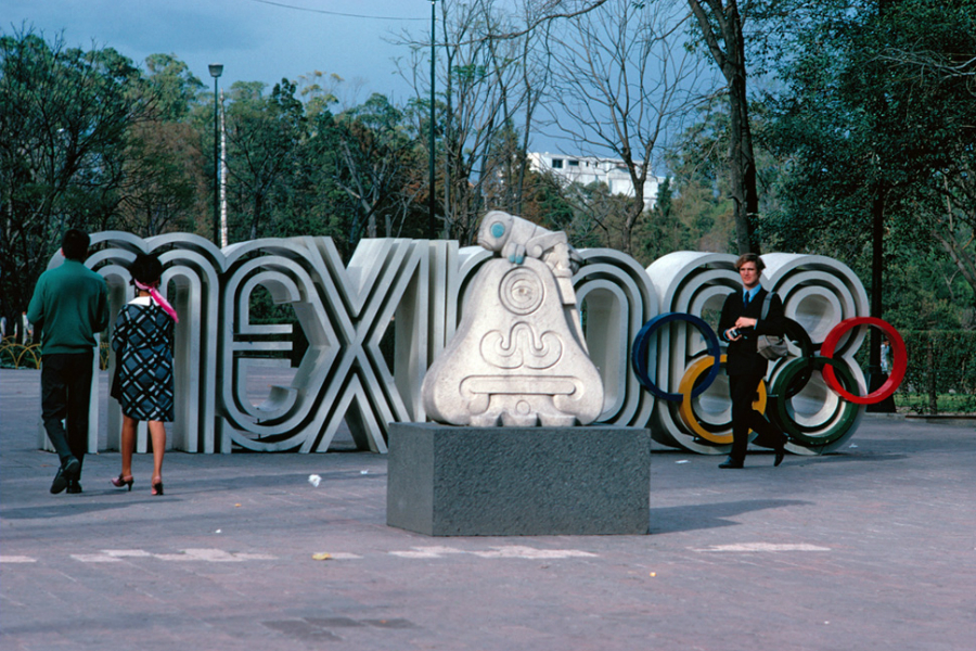
What are we left with? Work that is driven by its own ‘graphicness’, and this often leads to the over-use of that material devise of graphic design – the visual cliché. The rich graphic heritage of football and the World Cup is too tempting for designers to ignore. Tramline typography that channels Lance Wyman’s classic (and still fresh) Mexico Olympics, or Adidas’s 3-stripe brand signature crop up repeatedly, as do national symbols.
There are still, however, an imaginative range of styles and responses to be found from individual artists, all working to the same brief. Uniform’s 32|64|90 project proves this, as does our own I Don’t Love Soccer exhibition. The authorial voice of different graphic designers and illustrators is clear to see, expressed by preference for particular processes and formal ideas developed over a number of years, reminding me of an essay by the American designer and writer Michael Rock (2013) in which he reflects on his preoccupation of the notion of Designer as Author:
“We are intimately, physically connected to the work we produce, and it is inevitable that our work bears our own stamp”.
However Rock (2013) delivers a cautionary note elsewhere in his book:
“At some point you evaluate your own work and ask yourself, ‘Am I aware? Is this work banal? Or is it interesting?’ You have to recognise your own clichés and understand if you’re actually manipulating them or being driven by them.”
Reflecting on all of the graphic output produced for, or about, this year’s World Cup, I can’t help feel that more of us need to ask ourselves these same questions.
Ian Mitchell is Programme Leader Graphic Design and Illustration at Liverpool John Moores University
I Don’t Love Soccer Because Soccer Has Never Loved Me exhibition continues at Bold Street Coffee, Liverpool — free entry (just buy a coffee!)
References: Eco, U (1986) Travels in Hyper-Reality Picador, London
Rock, M (2013) Multiple Signatures: On Designers, Authors, Readers and Users Rizzoli International Publications, New York