The Big Interview: Jonathan Barnbrook

")

Designer, Typographer, Provocateur? Alex Croll nervously meets the real Jonathan Barnbrook…
Entrusted with the task of interviewing Jonathan Barnbrook at this year’s Designival, I was understandably a little bit nervous. Barnbrook is somewhat of a legend within the realm of graphic design, and this was to be my first ever interview.
Barnbrook made a name for himself with his typography — a rising star of the early 1990s, a period which coincided with the increase in possibilities that were provided to designers by the development of the Macintosh. Today, his self-titled design practice is one of the most well-known in Britain, with a client base stretching as far as Tokyo.
It is, however, his collaborations with artists from other creative fields that has really brought Barnbrook into the spotlight: Damien Hirst and David Bowie are just a couple of names in his enviable address book.
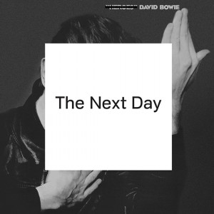
David Bowie’s release of The Next Day in 2013 put an end to a ten-year hiatus by the artist. The third in the series of albums with Jonathan Barnbrook in charge of the artwork — previously providing those for Heathen (2002) and Reality (2003) — it sparked discussion across the globe, not only in the way a much revered artist’s return would normally do, but also due to its polarising cover art.
Underneath his name in all the Designival literature screams the description ‘Designer, Typographer, Provocateur’; the latter is a title Barnbrook seems to hold some reservations about. With fonts named Infidel, Moron and Tourette, being dubbed a provocateur can’t really come as a surprise. For Barnbrook, it’s never been purely about the visual element of graphic design; his work is multifaceted, and beneath the serifs lie statements about the social and political situation in which we find ourselves.
Introductions and pleasantries aside, his Designival lecture quickly moves onto that album cover, with the audience sitting on the fence as to whether it’s the laziest or most genius album artwork ever produced. A handful of screen-grabbed tweets imply that the internet isn’t quite so undecided. He clicks through a number of the most deploring, confirming that 140 characters doesn’t really allow for a balanced and carefully composed critique, instead just a few choice words. Yet he seems surprisingly apathetic about the whole situation, especially considering the insulting and personal nature of some of the comments.
The lecture highlights Barnbrook’s eloquence, something I’ve read about in other interviews. He is incredibly articulate, which I can’t help but be surprised by, given that he’s in a profession which invariably requires him to spend most of his day staring at a computer screen.
Following the talk, Barnbrook and I step outside, squinting in the sun after an afternoon in the echoey halls of Camp and Furnace. Seagulls squark and Barnbrook asks: “Are we near the sea?”
“Sort of”, I reply, wondering whether the estuary’s close enough to make it acceptable. I decide not to get too bogged down with the details. We sit at a conveniently placed, if somewhat out of keeping, picnic bench.
The first item on the agenda has to be that title of ‘provocateur’. He doesn’t take much pressing, seemingly keen to set the record straight: “I don’t set out to try and provoke anybody, that would seem like it’s an empty statement. There’s no point in being controversial for the sake of being controversial.”
Working on designs for causes such as Occupy London, there’s bound to be an element of controversy. A recurring response to this collaboration by commenters online is the questioning of whether through providing it with a visual identity, Occupy is on the verge of becoming a brand itself — another corporation in a capitalist economy.
“I think people are tremendously cynical,” he says, “that’s the problem. What a logo can do, what a symbol can do, is that it actually unifies people, to understand themselves as a cohesive movement. So this idea of it being a brand, no; what they are trying to do is provide a focal point for people to understand that there’s a movement.”
Working for protest groups, how does one measure the success of a campaign? Does design actually work as a tool for providing change? “You can’t measure it. It is one of the tools of protest, it’s not the end result of protest. The thing you have to do is get something on the mainstream political agenda. That occurs for many reasons; one is that people are suddenly ready to accept an idea, whereas they weren’t previously.
“It’s only because of lobbying, agitation, dissent, including the use of graphics or anything else that will create that situation. I’m 100 per cent sure that graphic design facilitates that.”
I just couldn’t resist finding out more about the Bowie collaboration. I ask to what extent he was starstruck, if at all, when he first met Bowie. He laughs and looks at me almost in disbelief for asking such a question.“Of course I was starstruck, it’s David Bowie!” This is followed up with a Beatles reference, putting the situation into a context only appreciated fully in Liverpool. “What The Beatles were to the 1960s, he was to the ’70s, basically.”
Usually this sort of thing feels like an outsider’s poor attempt to connect with the people of the city, but this feels a bit more genuine. It’s clear that Barnbrook has a lot of respect for music, appreciating the fact that it’s universally comprehendible, a characteristic in which graphic design is unfortunately lacking.
His nonchalance about the criticism towards the album cover in the lecture was quite alarming, so I ask what effect it has on him: “Of course, when you work really hard on something — sometimes I almost kill myself working on projects — and then you read a load of comments about how shit it is, it does hurt. But also, I think it can be quite good for helping you move on to the next project.”
With this in mind, I’m keen to find out whether he still actively seeks to read the reaction to his work, or if he just waits for it to fill up his inbox. “I did for the Bowie stuff, because I was just really interested in peoples’ reactions — I just didn’t know. I was terrified that it was going to fall flat on its face; not in terms of people not noticing, just of people not getting it.”
It’s refreshing to hear someone of Barnbrook’s status acknowledge the feeling of doubt that we all have whenever we bring something new to the table. That anxiety inside as you watch the red pen hovering over the product of your labours, knowing it could go either way; your success hanging in the balance.
Having experienced that exact feeling before the interview, Jonathan says something which holds a lasting resonance with me: “The feeling of terror is the first thing you fight.”
Alex Croll
This article has been commissioned for the collaborative #BeACritic project — an annual programme of mentoring and commissioned critical articles for North-West-based writers, initiated and supported by The Double Negative, Liverpool John Moores University and Arts Council England. See more here
More at barnbrook.net and designival.com
Images courtesy Jonathan Barnbrook and Designival 2014