Please Come to the Show: Artist Invitations From The MoMA Library
Despite online competition from the likes of Facebook and Eventbrite, Maja Lorkowska realises that nothing compares to the art of the printed invite…
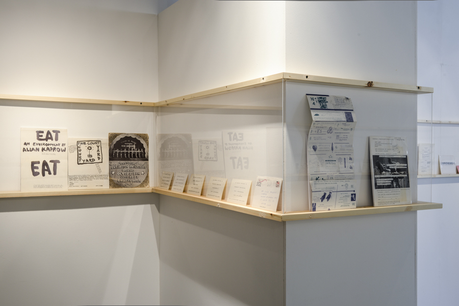
LJMU’s Exhibiton Research Centre is currently home to Please Come to the Show; a rich, compact display of artists’ invitation cards, flyers and ephemera from the Museum of Modern Art (MOMA) Library. Curator and bibliographer David Senior brings together a fascinating array of prints, predominantly originating in New York from the early 1960s to the present day, revealing changing attitudes and interests from artists throughout the past five decades.
Described as ‘important research documents’, the display provides an important insight into ways in which creators engage with an audience and influence their reactions, even before coming into contact with the artwork. From Carolee Schneeman’s freely assembled collages and pale photocopies, to the carefully embossed letters of Gilbert & George, the invitations are presented chronologically, side by side in a row on the viewer’s eye-level, enabling close and careful inspection of every piece. Indeed, due to their very nature, the work itself is fairly small in scale, demanding more than a mere glance, making the exhibition a fairly time consuming but largely satisfying experience.
Despite encompassing a period of around 50 years, initially, it can be difficult to distinguish between the older and more contemporary invitations. It would seem that the art of persuasion in paper form remains largely unchanged, and yet is far from becoming an archaic system of communication. In fact, the existence of the exhibition itself is a subtle commentary on the shift towards online exchanges and invitations arriving in the shape of Facebook and Eventbrite notifications, rather than in envelopes.
Usually reserved for graphic designers, this quiet celebration of the (often overlooked) printed invite makes a point of emphasising the artist’s intentions, rather than simply displaying a collection of aesthetically pleasing fonts and accompanying images.
This is especially apparent in the earlier invitations, which not only encourage the public to come and see the art itself, but act as cryptic manifestos, step-by-step guides, jokes, or even seemingly random, incomprehensible images and motifs. Perfect examples: Claes Oldenburg’s show in Judson Gallery, New York (1959), advertised with the words, ’I see/ artists/ clumsily duckwalking/ through time/ jiggling!’, surely must have attracted a wide audience; just like Robert Morris’ A Concert of Dance (1964), which used the motif of a footprint stomped straight onto the surface.
While some artists adopted the traditional approach of a formally worded proposition, concluded with an equally formal squiggly signature, others embrace a manner of irony and playfulness, conceptually reassembling the artworks on show. Undoubtedly, one of the most significant elements of Please Come to the Show is the humour and self-awareness of the artists.
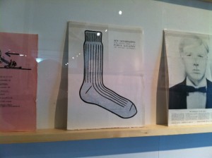
Manifested in statements like ‘The act of drinking beer with friends is the highest form of art’ (for a show by Tom Marioni); or the invitation to ‘Eat this show’ printed on a paper plate (an exhibition combined with a culinary event), it would seem that having to use a limited amount of space to attract the public and express ideas as succinctly as possible, many artists had the courage to highlight the most challenging aspects of their work.
Indeed, some invitations were created as an artistic call to arms, like the ‘Benefit for the Student Mobilisation Committee to End the War in Vietnam’; or encouraging female artists to ‘paint to death your favourite male art idol’ at ‘Massacre’, a feminist art happening. These recall the revolutionary spirit and romantic approach of artists to their work, an aspect present throughout the decades.
An invitation to ‘Readykeulous: The Hurtful Healer: The Correspondance Issue’ at the Invisible Exports gallery was formulated as a ‘letter to the world’, addressing issues of right and wrong, commenting on ‘everyone’s desire to be happier’, rather ‘than everyone’s desire to be happy’. These callouts make apparent the artists’ belief in their ability to cause change and influence the public, which remains a common theme throughout. At a time when the public often loses faith in the artist as a revolutionary, this is a particularly relevant issue to address.
Designed by John Webster, the installment of the show could perhaps be described as minimalistic, with a simple row of works, placed side by side, on narrow wooden shelves around the gallery space; the idea coming from the simple, personal action we use to place cards on shelves at home. Indeed, this works well when paired with the both aesthetically and conceptually rich works; unfortunately, almost every single piece on show is double-sided, an aspect which remained overlooked, as there is no way of examining the back pages. While generally this does not hinder the exhibition experience, it can cause confusion when we encounter pieces which do not incorporate any information.
Vitrines were also used for the display for a number of pieces, which in the case of Richard Long’s flyers is particularly appropriate: having to look down to admire the print actually corresponds with the work of land-art itself. Deliberate or not, this particular selection of works is presented simply, but successfully.
This, however, will not necessarily be everyone’s view. The show could be accused of name-dropping, or presuming we know more about the selected artists than we actually do; it could be incomprehensible to the visitor who doesn’t have a basic grasp of art history. There is a long paper list of artist names available at the entrance, but there are no explanatory notes in sight. Although the exhibition is of an archival nature, the curators were perhaps slightly presumptuous in their belief in the clarity of the display.
Perhaps what makes the show most interesting is the dialogue between the pieces; an air of complementary artistic attitudes which characterise the decades, and the revolutionary spirit of creation in the artistic hub that is New York. With a focus on installation, performance and staged conceptual works, we can observe art’s sudden transformation, escaping from the gallery walls, into events, happenings and discussions.
Please Come to the Show provides a glimpse into the history of early contemporary art from a different perspective, and while some artists adopt one that is purposefully skewed, others utilise their self-awareness and genuine humour: all to encourage the audience to accompany them in experiencing art. And it is this everlasting desire to share the products of their creativity that allows the art of the invitation to stand the test of time.
Maja Lorkowska
Main images courtesy Andy Freeney LJMU
Please Come to the Show, Exhibition Research Centre, Liverpool School of Art and Design (LJMU). Open until 11 April 2014, 10am-5pm, Monday-Friday, free entry