Artist of the Month: Matthew Storrow
Our new Artist of the Month is fascinated by abandoned temples, old sea forts, printing, sci-fi, and Piranesi. What’s not to love?!
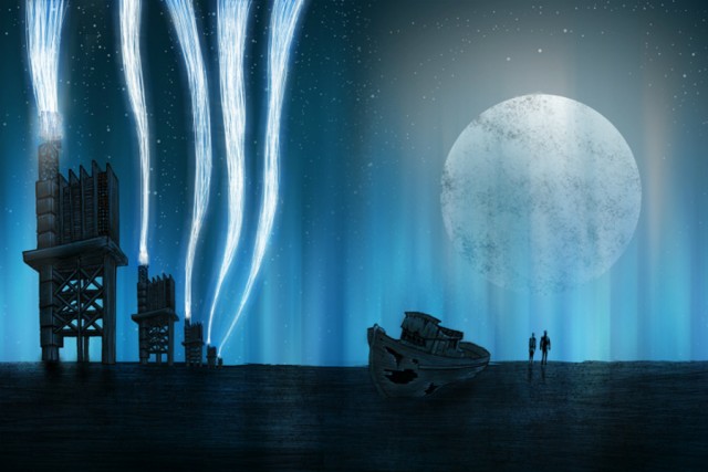
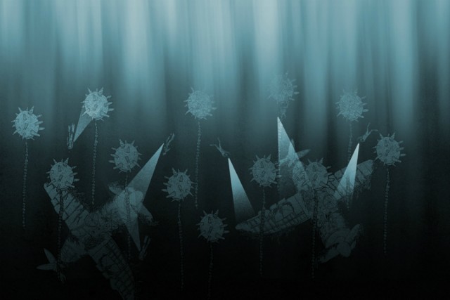
The banner Matthew Storrow has created for us nods to all his influences in sci-fi, the post-apocalyptic landscape, and derelict architecture. Pylons litter the craggy vista, broken and useless, symbolic perhaps for communication or signal. Or maybe they’re oil rigs empty of fuel? A lone girl stares out to a time-lapsed sky; is she a ghost? Radioactive? Diseased? Is she even real, or a memory of the human race in a world long abandoned by any living thing?
The existential catastrophes of Cormac McCarthy’s The Road and Richard Matheson’s I Am Legend spring to mind; what would it actually be like to live alone and in fear if society collapsed?
Shaking off rather gloomy notions of doom, we turn more closely to those influences. It’s not hard to see in Storrow’s work the architectural details. He cites Highline NY, Detroit, sea forts, abandoned temples and theatres as current obsessions.
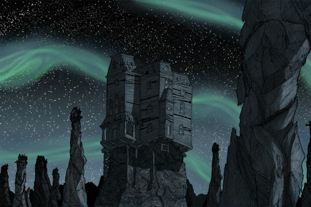
He is a massive fan of architectural printmaker Piranesi, the son of a stonemason who documented all the ruins from the collapse of the Roman Empire. It’s detailed, architectural oddities that set the scene in Storrow’s work. “I think if you showed Piranesi’s drawings to people in Liverpool, it would resonate with them; you grow up with ruins … for example the tobacco warehouses, rail tunnels … there’s just big famous buildings in disrepair everywhere.”
It’s not surprising to learn that he is a trained Architect, graduating from LJMU in 2010 followed by a brief stint at Holder Mathias Architects, London.
“It was really in uni that everything took off for me. Rather than being all about Architecture, the focus was on Design, thinking behind the specific design instead of just coming up with the most rational solution to a problem. Alongside Architecture I was doing artwork for bands as a hobby. By the end of the degree, the hobby had taken over the career.”
It was just as Storrow started to work full-time as a Graphic Designer that he ironically got the call from Holder Mathias. His main job was designing a complete Olympic complex for Turkmenistan. “It was the most surreal experience ever. You’d send something over, they’d send it back, saying: “That’s great, but can we have a 40ft gold horse at the front entrance instead?”"
Do you think the experience turned you more onto Graphic Design? “Yeah, it completely sent me the other way; although the job and the people were nice, it was just soul-draining work, almost like admin. Whenever I’d work with another part of the team, like designing a logo, it was a breath of fresh air. It (Architecture) does help you work more efficiently, with more discipline … deadlines are such a big part of being an architect. Everything I draw is coming from things I’ve seen as an architect.”
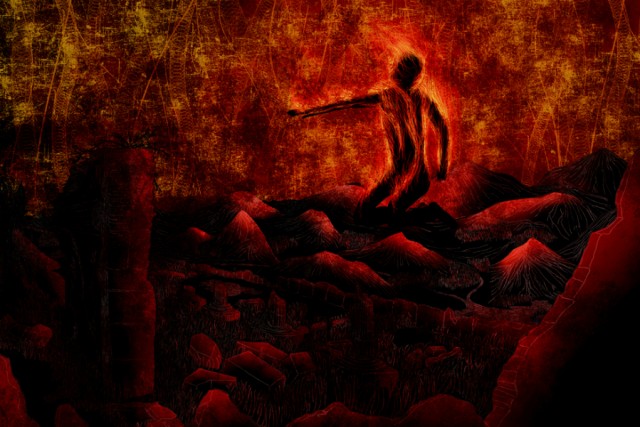
So what about the other weird elements that propel the structures into a different, more surreal realm? “I’m massively into fantasy and sci-fi; I love the Prometheus idea of going back to the past, in the future … there always ends up being a little glowing kid in my drawings. I don’t know where it comes from really. I try to start off with a bit of narrative … like old sea forts … or abandoned oil fields in Azerbaijan; I was imagining what it must be like to live next to a completely destroyed landscape. There are pictures you can find, these fields are by the sea, there are families with parasols and kids running round. It’s crazy.
“Most recently I’ve got into the Game of Thrones books, the world is utterly mental. At one end there’s a 900ft wall that keeps out all these monsters in the North … mad dream sequences. Also, everyone loves Blade Runner. It’s the most thematically dense thing I think I’ve ever seen. You can watch it a thousand times and every time there is a different concept to latch onto.”
Storrow comes into his own when describing the ideas behind a specific work; he talks about artwork for long-time friend and collaborator, musician Jon Lawton.“With Jon’s new album artwork (trailer for White Lights here), I was imagining this boat trying to get to this Maunsell sea fort, because there’s something in it that they’re trying to get. They hit some rocks, that’s why there’s a sinking, smoking ship in the background. The fellas have to bail out and swim towards the fort.”
What’s it like working with a musician? “It varies quite a lot. Working with Jon is great; he always wants to do the most, have full design with booklets and slip covers, posters – you can completely go for it. But then you get some people who are like: “Can you just put this effect on this picture of my face?” Haha. It works both ways.” He declares his dream clients would be Bjork, Mastedon, and Mars Volta (even though they’ve split up).
The main ambition is to carry on working in different print and digital media; hand-drawn and screenprinted posters and art prints, toys, eventually travelling to festivals in Spain and the US. He’d love to design a range for Mondo, like his heroes Daniel Danger (“His work is really rural, surrealist, all ghosts and packs of wolves. He’s probably my biggest influence at the moment”) and Olly Moss (“I kind of social-stalk him, just for the amount of work he churns out!”). He’s got sketchbooks full of ideas for future projects.
“It hasn’t been too scary becoming self-employed; Architecture and Graphic Design dovetail together really well. That said, I was always the silly one in uni saying, hey, I’ve designed a cave! While everyone else was designing schools and museums. Every project I did was always ridiculously over the top. There’s always a few in every course” he says, smiling.
We look again at Storrow’s banner artwork: lovingly drawn in an act of layering, starting off with a sketch, refining with Photoshop and Illustrator, then drawing over it again by hand, again and again. We have no doubt that you’ll be seeing a lot more of his dream-like work; snap it up while you can. You never know, it may be a future collectable, if we survive the apocalypse …
Look out for Matthew’s limited ed. posters for album White Lights around the end of March
To see more of Matthew’s work, and contact him to make some sweet artwork for you, visit his main website mockupdesignlabs.com
