Designival – Reviewed
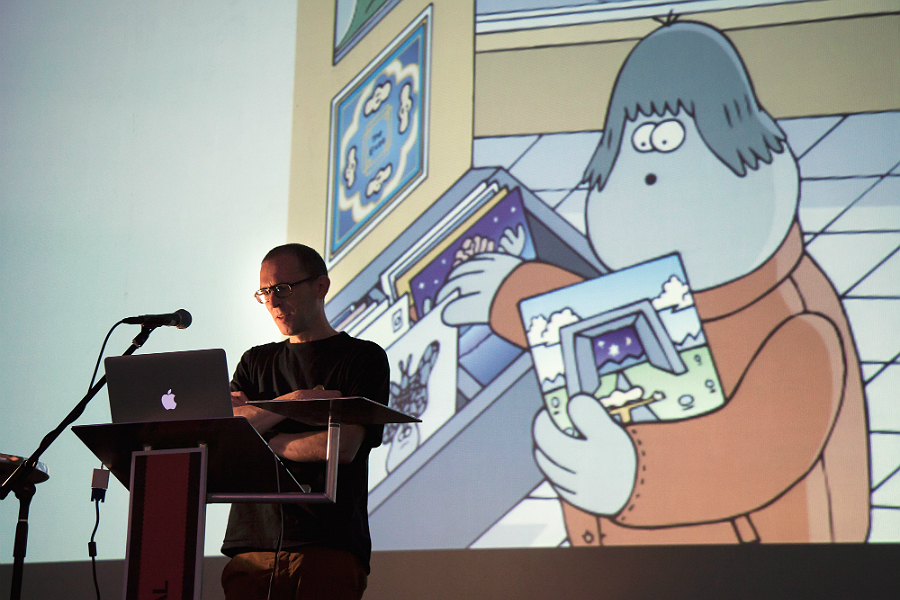
Graphic Designer Thom Isom on his experience of Designival, the North’s biggest and most comprehensive design showcase of the year…
The morning kicked off with a design breakfast. What’s that, you ask? In short, all the coffee and croissants you could get your hands on – definitely needed for the busy day ahead. Talks, masterclasses, portfolio surgeries, pop up shops and more. Designival had a lot offer…
Belgian born Graphic Designer Sara De Bondt got things underway (locals might recognise her studio’s work on Liverpool Biennial 2012’s branding). Her studio’s approach is very research and ideas driven, with a strong emphasis on typographic outcomes. She chose to showcase three proposals for European based art events – Interieur 2010, Radical Nature 2009 and Artissima Art Fair 2011, each focusing on different approaches to branding, design and exhibition curation. As she talked through the stages of proposal, ideas and development of each project, it was a joy to see the level of research and direction carried out by her team.
A stand out example was her work for Artissima. De Bondt shared her idea of not only creating a brand for the fair but also providing a service – one that collated all the information behind the artists, their work, organisers, staff and visitors. Her team curated a pop-up stall at the fair, with info-graphics on site detailing the fair’s activity. This process was used in all aspects of branding and design – with a strong and stylised info-graphic identity – applied to all print, signage and even the building of the fair itself. The rigorous amount of time and research showcased by her studio was refreshing, proving that a designer’s job is ever changing.
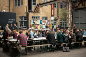
After a tasty cup of soup, and a spot of shopping with Unit Editions, came the second in a series of masterclasses taking place throughout the day. This was my chance to get some practical advice from one of Liverpool’s leading design studios, Uniform.
The workshop provided an introduction to Arduino; an open-source electronic prototyping platform that allows users to create what Uniform called ‘Physical Apps.’ After a quick introduction and a showcase of what you can do we were thrown into the deep end. Handed a motherboard, a box of LEDS, resistors and a laptop, the sessions suddenly felt like high-school electronics class all over again. However, with a room full of designers, programmers and creatives, the context was quite different.
It proved a good showcase for a variety of uses for the platform, with Bubblino taking centre-stage: through a simple tweet from anyone in the world the ornament blows bubbles into the room. In a time when we’re so engaged with the internet, Arduino and its developers are giving us the ability to look away from our screens and enjoy the physical. After 15 minutes of tinkering and asking questions of the workshop host, I managed to make two LEDs blink… OK, I admit I’ve got a lot to learn, but the workshop left me bursting with inspiration and ideas.
The afternoon brought with it talks from some industry legends in James Jarvis, Simon Manchipp and Lance Wyman. These are guys who have worked with some of the world’s largest and most respected companies, while putting their own unique stamp on branding history; a great chance therefore to delve into the minds of professional creatives.
Jarvis (pictured, top), renowned graphic artist and toy designer, talked of his influences and inspirations – he shared his love for skateboarding and his on-going ‘Spheric Dialogue’ project. Best known for his work with the likes of Nike and MTV, Jarvis enlightened us in the shift of direction he’s currently taking as an illustrator, moving away from brands and curating more personal projects based on the ideas of philosophy and everyday life. Simon Manchipp was insightful and playful. He shared his experience in branding with a showcase of his studio’s latest projects; rounded off with his top ten tips for creating the perfect brand.

After a short break and a quick pint I headed straight back for the headline talk from Lance Wyman (above), one of those designers on every professional’s bookshelf (his iconic branding for 1968 Mexico Olympics can be found in almost every modern design book). After a brief introduction into his past – at university, General Motors and the military – he delved into the details of his branding for the Olympics.
He admitted before starting the commission he had very little knowledge of Mexico: “I knew they had piñatas.” His being influenced by Op-Art married with research into early cultures of Mexico shaped the overall style and look of the project: Mayan symbols, totem poles and clay stamps are all referenced heavily in the design. Produced on a surprisingly small budget, it was great to hear how he and his team managed to save money with the simplest of solutions. We also heard about some of his more recent projects, specifically his ongoing work updating the Washington metro map (a piece he designed almost three decades ago, he’s now been hired to give it a makeover).
Following on from Wyman’s talk came the head-to-head feature between Wyman and Simon Manchipp, chaired by the editor of Creative Review Patrick Burgoyne. The theme of the discussion seemed the perfect catalyst for debate – the success (or otherwise) of the London Olympics 2012 branding. Manchipp and Wyman (who have had heavy involvement in the branding and design for previous Olympics) shared stories of their experiences. The difference was worlds apart. The most intriguing thing was how little pressure Wyman encountered compared to Manchipp.
The pressures of working on such an important event today are predictably huge, the rules and regulation that goes into the branding of something like the Olympics is no small feat. The discussion brought to light the struggles of creating designs for a world audience; the timing of London 2012 (both economically and socially); and the overall application and execution of the brand. Burgoyne quizzed the audience themselves on their thoughts on the branding: no surprise, an almost 50/50 split.
The branding for London 2012 has always been the elephant in the room and tonight seemed the perfect opportunity to tackle it head on. If only more time was given to dig into the opinions of Manchipp and Wyman, we could have learned more. That said, it was great to hear the stories and process behind the projects – it’s safe to say that all designers can reflect on the issues raised in the evening’s debate.
So goodbye Designival 2012, you’ve been great. Now, what’s the plan for 2013?
Thom Isom
Images courtesy Toni buzolic @ Uniform
