Type Motion — Reviewed
Just what does ‘Schriftfilme’ mean? And how exactly do you present a traditional film archive in a contemporary gallery space for a new audience? Jack Roe visits FACT’s new ‘type in motion’ exhibition to find out…
Considering the scope of the project — 13 years, three exhibitions, two countries and a book in two languages, amongst many other facets — it is no real surprise that Type Motion, FACT Liverpool’s new exhibition, can feel overwhelming.
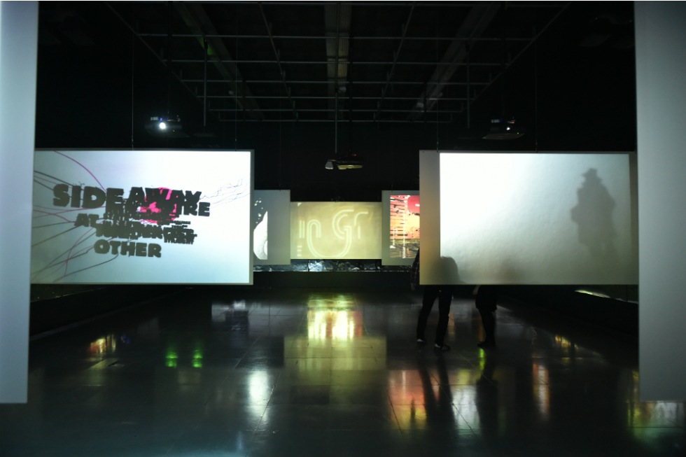
Gallery 1 is taken up by seven separate projector screens hung from the ceiling, and with mirrored material attached to the walls to provide an ‘infinity effect’ that, due to the positioning and size of the material, is ineffective and fairly distracting. The screens are occupied by a rolling selection of examples of what the curators refer to as ‘Schriftfilme‘ (a word that is apparently without a literal English translation). I found the experience distracting and almost uncomfortable. The situation was odd; here I was confronted by a multitude of projected examples of the written word in film, several of which, although not all, were in my native language, and yet I couldn’t make sense of anything that was happening.
It was only slowly, after spending several minutes in the room, that I began to realise what I was seeing, or rather what I wasn’t seeing.
I had expected, from the pre-exhibition promotion and accompanying leaflet, to see a show that combined numerous examples of text and typography in a filmic context, to be able to pat myself on the back when I recognized a title sequence — and surreptitiously Google the odd phrase from others that I didn’t — so that I could go home and brush up, and leave feeling enriched.
What I was presented with instead was a gallery experience that challenged the way I interacted with two separate media. The point that I was missing was that the words themselves were not necessarily important; the focus was placed upon the form and the motion rather than the meaning. On reflection, the name of the show should probably have given me a clue.
Gallery 2 is entirely different, and much more focused on audience participation. The most immediate impression of this section of the exhibition is the innovations in coding and design that it presents; from the motion-controlled console that steers the user through a vast cityscape, to the playlist generator in the opposite corner that houses an archive of films which can be projected, at the users command, on one of two nearby screens.
It is here, whether engaging with either of the consoles or simply watching others do so, that the exhibition is most rewarding. The sheer scale of the archive — everything from music videos like Tiger Dust (2009, above) to Len Lye’s animated postal advert Trade Tattoo (1937) — and the intellectual weight of the endeavour ensures that the style of presentation avoids the temporary reward of novelty; indeed, it is only on closer inspection that the richness of the archive becomes apparent.
In contemporary gallery interpretation, it is generally accepted that merely pointing a visitor in the direction of a work of art is no longer enough to pique interest. Type Motion uses the most interesting aspects of new media to provide the user with a truly unusual guide to a specific aspect of film.
The only shortcoming that I personally experienced is that my own interest in the subject matter falls far short of the creators. Of course, that is probably true of every exhibition, but it feels particularly relevant in this case. I left with an overriding sensation of frustration, due to the knowledge that, considering the whole scope of the project, I had merely skimmed over the top.
Post-exhibition, I had the privilege of sitting in on a talk given by the curators of the show — Dr Bernd Scheffer, Dr Chistine Stenzer, and Dr Soenke Zehle (xm:lab) — where I was further educated on what exactly a ‘Schriftfilme’ is: essentially, a genre of film defined by the interplay between the written word and the moving image. It was suggested that this new genre — in which words and titles are used as part of the visual narrative, rather than intrusively aiding the viewers’ understanding of the plot — represents a cultural evolution in the way that audiences interact with the written word. That in a digital world of fluid motion, even the rigid logic of type can be adapted and included in movement.
While I remain slightly sceptical of the conclusions, I think these films are stylistic and visual innovations, rather than indicators of a fundamental shift in culture. The idea, however, is an extremely interesting one. Type Motion is, according to the instigators of the project, an attempt to present the findings of an extensive research project in a format that expands and challenges the notions of a simple archive; to provide the user with an unusual and rewarding experience. I feel that upon my first visit to the show that they have succeeded.
In summation, the best way to approach Type Motion is as a learning experience; not one that feels overly stifling or that highlights previous ignorance, but the result of a group of highly ambitious people who have clearly and thoroughly enjoyed the research put into the show. The enthusiasm for the subject matter shows, and I would say that it is a show almost unique in its potential to reward multiple visits.
Type Motion is well worth your time, as much of it as you have to spare; although I would tentatively suggest that unless you have a specific interest in the recent history and stylistic progression of moving image, then it may well struggle to hold your interest.
Jack Roe
Type Motion continues at FACT, Liverpool, until 8 February 2015 — free entry
Feature image: Anemic Cinema (1926) by Marcel Duchamp. Image courtesy Succession Marcel Duchamp/DACS London 2014/Light Cone